It really isn't!!
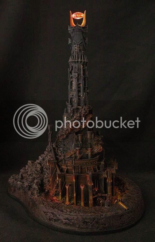
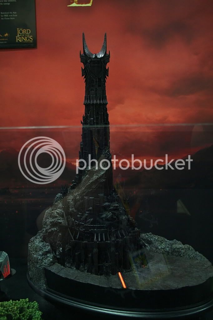
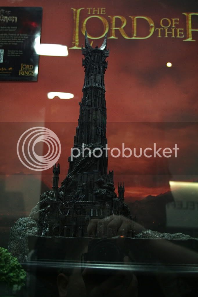
Sorry Moe, but have you seen the photos above?? I've seen the photos, and heard testimony from people who were there and saw it.
The Danbury Mint one is nice to have if you need to save the money and space, but it's squashed together in certain spaces, the top of the tower is smaller than it should be and the details that are on Wetas own creation just aren't there...and the paint scheme is just all over the place. And then there's the eye
")
Weta made a decision, we have to deal with it