You are using an out of date browser. It may not display this or other websites correctly.
You should upgrade or use an alternative browser.
You should upgrade or use an alternative browser.
DC Direct: The Dark Knight Rises
- Thread starter Johnny Utah
- Start date


Help Support Collector Freaks Forum:
This site may earn a commission from merchant affiliate
links, including eBay, Amazon, and others.

dominishin
Super Freak
That batman looks ugly. Looks like HT's TDK V1.
The bust seems to look a little better.
The bust seems to look a little better.
hunnipot85
Super Freak
- Joined
- Jun 7, 2008
- Messages
- 6,399
- Reaction score
- 27
There's not a snow ball's chance in hell that Hathaway owns an ass like that. Not a chance.
That was my first thought when I saw that.
Just like how the companies make the actors more muscular/toned/fit?

- Joined
- May 31, 2011
- Messages
- 16,203
- Reaction score
- 55
Just like how the companies make the actors more muscular/toned/fit?
Erm, not really.
 if anything, Hardy kinda has a little bit of a gut in statue form.
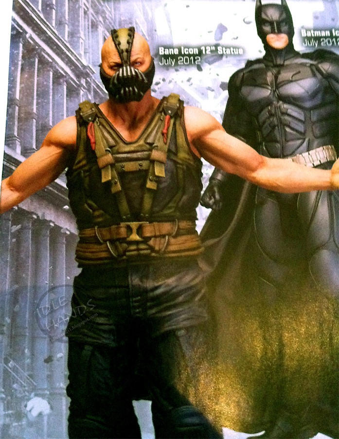

DarkMagic
Super Freak
Yeah but look at how cut the statue's arms are...Hardy bulked up a bit, yes, but he just doesn't have that much definition.
- Joined
- May 31, 2011
- Messages
- 16,203
- Reaction score
- 55
The statue is a bit more defined, but not by much.Yeah but look at how cut the statue's arms are...Hardy bulked up a bit, yes, but he just doesn't have that much definition.

- Joined
- Mar 30, 2011
- Messages
- 2,755
- Reaction score
- 189
I'm getting anything that actually looks like Hathaway
bonus for improved butt
bonus for improved butt
Blood Electricity
Super Freak
I'm gunna defend dcd on articulation purely based on how awesome friggin killer croc looks from the arkham city line. They are trying to add more articulation as well by the looks of that.
But yeah, I still think they will look better than mattel.
But yeah, I still think they will look better than mattel.
DC Direct stuff always looks horrible in the end, and the plastic they use is kind of crap.
the arkham asylum/city figures are pretty nice

JEDSTER
Super Freak
DC Direct stuff does not always look crap. I do agree that some stuff could be better (like DCD Justice: Wonder Woman figure that looks very manly)
But, I would go for DC Direct any day and (have been) over Mattel's DC stuff that looks more toy-like and lack of realism. Yes, I know that some of you may argue about the articulations. I do not care about articulations that much, I care more about the overall look of the figure-most importantly the realism feel of it or how close it is to the artist's representation of the character.
And yes, just like what Steve (Gipetto0812) said the Arkham Asylum/City line is f%^&ing nice.
I have compared every single 6-7 inch Batman figures between DCD and Mattel. I don't like any of Mattel's effort.
I am just glad and definitely stoked that DCD is doing the 6 inch figure line for TDKR. So far all the smaller BATMAN figures I collect from DCD has been pretty awesome.
Last edited:
bandito
Super Freak
There's not a snow ball's chance in hell that Hathaway owns an ass like that. Not a chance.
Well it could be the stuntwoman's butt that the statue is depicting
Dusty_Lane
Freakzoid
- Joined
- Sep 4, 2011
- Messages
- 84
- Reaction score
- 0
Pshh anne hatheway is way to skinny to have ass like that anyway.
Oh I don't know......it looks pretty good in that movie Love and Other Drugs.
")
Marvel-ous
Super Freak
- Joined
- Jun 9, 2009
- Messages
- 1,486
- Reaction score
- 0
Just like how the companies make the actors more muscular/toned/fit?
Yes, exactly like that. And what's your point again?
intothevoid
Batmod
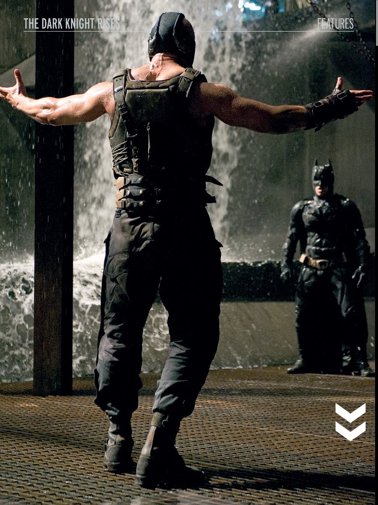
The Bane statue looks quite bad IMO
Hardy's Bane is not meant to look toned/fit, he's just meant to look like an animal and strong, which Hardy does, but the statue doesn't translate that too well
Hardy's Bane is not meant to look toned/fit, he's just meant to look like an animal and strong, which Hardy does, but the statue doesn't translate that too well
The designs all seem to be uniformly awful.
Bane just looks completely out of place in the world of the first two films.
The Batman suit is just redesigned for the sake of redesign and like the Iron Man films, starts to get worse instead of better at some point.
And Catwoman, where to begin? If you are not going to do a proper mask, at least have ears that vaguely resemble real cat ears, not vague black triangles. And what jackass thought thigh-high boots with heels out a porn movie was the way to go with a modern Catwoman? I would have though the Jim Lee Catwoman would have set practical footwear as an absolute must for the character, especially in a film series that strives for realism.
This film seems poised to enter the inglorious company of X3, Spider-man 3, or, worst of all, Superman III.
Sachiel
Super Freak
- Joined
- Dec 19, 2005
- Messages
- 11,594
- Reaction score
- 689
Bane's look is no more out of place than the Joker's flamboyant outfit and Harvey's burned face or Batman's suit. The technical aspects of his mask also fit well with the previous films.
Batman's suit is the exact same as it was in TDK.
Yes it would be nice if Catwoman had a cowl. Those cat ears are actually the goggles flipped over her head. The thigh-high boots and elbow length gloves did come out of the comics. It is interesting they went with the high heels and not boots. But it seems she will use them for more than just looking good.
The Nolan films aren't as realistic as people like to think they are... there's plenty of fantasy in them.
I highly doubt this film will be lumped in with the likes of those 3 superhero crapfests.
Batman's suit is the exact same as it was in TDK.
Yes it would be nice if Catwoman had a cowl. Those cat ears are actually the goggles flipped over her head. The thigh-high boots and elbow length gloves did come out of the comics. It is interesting they went with the high heels and not boots. But it seems she will use them for more than just looking good.
The Nolan films aren't as realistic as people like to think they are... there's plenty of fantasy in them.
This film seems poised to enter the inglorious company of X3, Spider-man 3, or, worst of all, Superman III.
I highly doubt this film will be lumped in with the likes of those 3 superhero crapfests.
intothevoid
Batmod
Nothing wrong with the Bane design, what did you expect, a luchador mask
Catwoman yeah i'd like to have seen a cowl but i'll reserve my final judgement.
TDK suit makes a ton of sense, the first Batman suit where he can turn his head (apart from Adam West Batman).
So
Catwoman yeah i'd like to have seen a cowl but i'll reserve my final judgement.
TDK suit makes a ton of sense, the first Batman suit where he can turn his head (apart from Adam West Batman).
So
cr`
Super Freak
- Joined
- Mar 22, 2009
- Messages
- 1,373
- Reaction score
- 0
articulations are overrated. i dont play with my toys anymore, they just have to look good when displayed. and thus sculpt > poa.So don't be surprised when they turn out to be just pvc statues where any articulation is useful only for production purposes.
Batman will have a crappy pose, Bane will look like he's singing and Catwoman will be sneaking around some rubble. Oh look you can turn their heads!
If I'm wrong I'll be damn happy.
too bad you cant see hathaway's face in all those items. if dcd is smart, those mask/goggles will be removable. but still i have to be thankful none has the catwoman's hair in stupid wind swept action pose. that is sideshow's specialty btw.I'm getting anything that actually looks like Hathaway
bonus for improved butt
i think these tdkr figs can be better.the arkham asylum/city figures are pretty nice
i agree that all the designs are lacking. i even loathe the first film's batsuit. nolan just doesnt seem apt at making cool superhero costumes. stories and characters is where he's great at, but he's lousy with directing action and designing costumes. he's like zack snyder's complete opposite.The designs all seem to be uniformly awful.
Bane just looks completely out of place in the world of the first two films.
The Batman suit is just redesigned for the sake of redesign and like the Iron Man films, starts to get worse instead of better at some point.
And Catwoman, where to begin? If you are not going to do a proper mask, at least have ears that vaguely resemble real cat ears, not vague black triangles. And what jackass thought thigh-high boots with heels out a porn movie was the way to go with a modern Catwoman? I would have though the Jim Lee Catwoman would have set practical footwear as an absolute must for the character, especially in a film series that strives for realism.
This film seems poised to enter the inglorious company of X3, Spider-man 3, or, worst of all, Superman III.
but lousy costume design is one thing, judging the entire film based on said lousy design is quite another. x3, spidey 3, and superman III all have shaky first films and then glorious second films. the quality of nolan's bat films have been consistent from the 1st film.
dominishin
Super Freak
The suit has much more reason for redesign for Batman than Iron Man. If he was redesigning for the sake of it he would have had a new suit for TDKR, which he doesn't (he's wearing the same suit as TDK). Not sure where that logic came from, sounds like finding criticism for the sake of criticism.
I would not want to see Zack Snyder's designs in Nolan films. Not sure what some of you are expecting for costumes in Nolan's batman universe. They fit fine, at least, better than films of the past have.
Anyways, Begins suit is the best batsuit. No matter how much nostalgia is attached to the Burton suits... they are severely outdated. I mean, look at that belt... and the design of the cowl, it looks like some weird jester's outfit.
Last edited:
breakersrevenge
Super Freak
I seen these in the flesh today...
Looks good in hand!!


Looks good in hand!!
Similar threads
- Replies
- 1
- Views
- 460
- Replies
- 7
- Views
- 933
- Replies
- 9
- Views
- 942
- Replies
- 0
- Views
- 239
Latest posts
-
 Action Figure Final Fantasy VII Remake Collectibles
- Latest: gonzales.shem23
-
-
 1/6 Hot Toys - MMS681 - Episode II: Attack of The Clones - Mace Windu
- Latest: Brokenhandpuppet
-
 InArt: The Lord of the Rings - Gandalf 1:6
- Latest: Scout Trooper