mrchris
Super Freak
I've got the brushes and paints ready but as you said it does look good along with GOD so that's a plus.
but as you said it does look good along with GOD so that's a plus.


 but as you said it does look good along with GOD so that's a plus.
I've got the brushes and paints ready
 .or how to do it wrong when I attempt
 .I will be uber carefull doing this,as I want a result I can be happy with to show how some simple knowledge knowing the movie(and pics) would have resulted in more accurate wounds(minor gripe for some)but nevertheless a big let down for me.
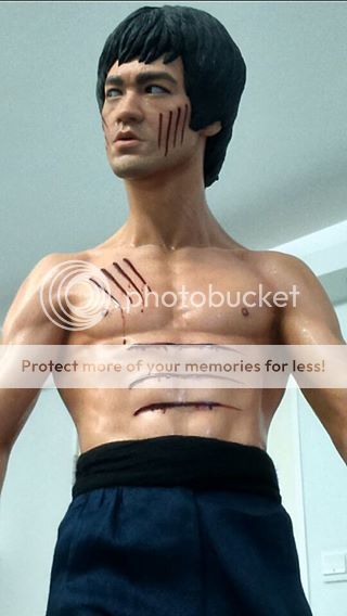
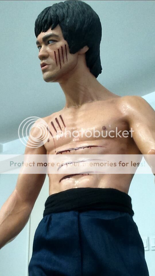
Nice pics mate.
Likeness on the head sculpt looks great in the second last one.
Skin colour looks good in your shots too.
There looks to be quite a lean on your statue....unless it's just the photos?
What's your overall impression having the piece in hand?

Thanks for your kind words, the likeness is fantastic as usual in any Arnie Kim work no doubt about that, as for the skin colour, well I did some adjustment and you're right, it's the photos.
My overall impression is, I'm happy as it looks better than those early pictures that surfaced, I guess it depends on the camera and people who take pictures not saying I'm better, Oh no not at all, it's just a fact that you can not do justice to these things when you take pictures using phone camera, that's why I took couple of them with my phone to show the difference, there are as we all know few things that are kind of a disturbing about this statue: the nipples, the cuts and of course the paint which it could have used more attention than this but over all I love this piece.
I've been studying Bruce Lo's pics again... and to be honest I kind of felt this from the start...I'm not sure he has repainted the body apart from embellishing the cuts. The paint still looks fairly even in his shots and I see the same subtle pink tones in his also present in xplOsive's pics - they are just less prominent because of the strategic lighting. He can correct me if I'm wrong but I think xplOsive has lit his shots (along with a stylistic aesthetic), to gain maximum musculature definition and maybe some of the more subtle shading and colour differences in the skin tone you see in Bruce Lo's pics are being sacrificed somewhat.
These really look like the same to me as what you are seeing in the less shadowed versions of xplOsive's pics. The skin tone is still fairly flat with some subtle pink accents that are coming through because the piece is more thoroughly lit. I really think it's coming down to lighting and the fact we are dealing with a translucent resin that is absorbing or reflecting light differently in every shot and every environment. And it should be said, for low quality pics, Bruce Lo's do look much better than most of the other phone camera pics we've seen but I feel it's more of a jag with the lighting. The lens pointing up from that angle in his shots could also be having an affect on the exposure off the skin and how it is being represented. I think it would also look (unfairly and misrepresented) a flat yellow in a different room, under different lights and with a different camera even. So maybe Lo's low grade pics are, by way of fluke, actually showing off the paint job in its truest sense to anything else we've seen rather than him repainting the thing. Just my opinion. Maybe he could confirm all this anyway?
The flat yellow paint in each camera phone pic actually wasn't bothering me as much as the cartoon version of Bruce we were looking at in a structural sense.
XplOsive's shots are the first to show the thing undistorted and correctly proportioned. This is mutually exclusive to any lighting set up or correct skin tone.
Yeah I'm in the same boat here. Although, the great likeness and pose are tempering longings for perfect paint jobs etc, which probably won't happen on future releases either and the price will be higher no doubt. It's actually gone up to $1100 at PC for this version.
Yeah I love the head sculpt on this. It's so life like. Great head sculpts are always my priority on collectables, along with the pose (if it's a statue). It's probably why I persisted with this and stuck to my order.
I just don't see it. I looked at the pics closely for a long time, then looked at mine, then looked at Bruce Lo's again, and compared to what I see in real life. I just don't see the noticeable tones, or any noticeable difference at all. It looks largely flat to me. It just doesn't look yellow like the early shots, that's all. Has a more realistic skin tone to it, but I think it looks that way in real life, and in my pictures, personally. Viewing this in natural light, it pretty much looks like it does in Bruce Lo's pics. Has a very pinkish tone to it. If someone posted that up and did not mention it was repainted, I would have just assumed it was a pic of a standard one.
Also, seeing this in real life, I really don't see why anyone would do a full repaint on it. Short of adding some more accentuated shading in certain areas (which really comes down to personal preference as I actually think it looks fine the way it is), I actually think the paint is fantastic. Using what appears to be a translucent base with layered translucent colours, I think they've achieved a fairly realistic skin tone on this. Painting over the top of it would take away a bit of the realism I think, as you'd lose the transparency and thus, would end up with something that looks solid and a little fake-looking, unless you were a very skilled artist. Part of the reason PVC head sculpts look so real is due to the translucency of the material.
Just to add, this statue does not look translucent, in the sense that it doesn't look see-through, but if you know what you're looking at you can tell there is some translucency to the material as there is depth to the paint. It has a similar effect to PVC headsculpts that you see on Hot Toys/Enterbay head sculpts, and their bodies for that matter. It just looks totally different when I compare this to my human Sideshow statues.
The sculpt on the body is a little soft in comparison to the proto. I think if it was a little more chiselled, you would end up with more noticeable shading in the muscles simply due to the cuts that would be more defined. Look at some of the proto pics and look at them carefully. You will notice that the skin tone is also largely a single tone with very subtle hues through it, and the majority of the shading comes from the muscles being so clearly defined.
This I totally understand. If you remember, I had a hard time making the decision to buy GoD due to the price, as up until that point, it would have been the most expensive collectible I would have bought, and I had a hard time parting with nearly 600 bucks for Enterbay's T800. I ended up passing once Pop bumped it up to 900 bucks, even though I loved the way it looked. I just didn't like it enough to pay 900 bucks for it.
Buying the Predator statue from AD changed my mentality regarding price though, but I also think it played a part in me buying GoD as I had just spent over 1k buying that statue (which I totally ended up regretting). But it did condition me to pay higher prices for collectables, and I've since PO'd stuff that was well over 500 bucks, whereas previously most of my stuff was under 500.
Simply put, you have to really want this piece to pay 1k for it. It's a hell of a lot of money, and if this was more of a 'that looks kind of cool, wouldn't mind having it' kind of statue, I doubt I would have bought it. Not for that price. There's not many pieces I would pay 1k for, regardless what it is. it's just too much money. These days I do not buy much at all, unless I really love the movie or character, as the prices of collectibles are getting out of hand, whilst the quality has either remained the same, or dropped. A Bruce Lee from Enter The Dragon is just so iconic though, and something I've wanted in my collection for a long time. An epic 1/3 statue was pretty much a no brainer for me, and this pretty much satisfies my need for a Bruce Lee piece in my collection. The guy is a legend and there is no better way to represent him in collectible form.
If I was in your position and had the GoD statue already, it would make it that much harder for me to buy this, and I would have a hard time justifying it. Having no Bruce Lee collectibles whatsoever though, made it much easier for me to make the decision to grab this.
It is fairly plain, but the subtlety in the shading works well, almost in it's favour. It really is something you have to see in person, in proper lighting to understand. Even then, opinions vary and you may not like it or see it the same way I do, but I just think with the realistic skin effect they've achieved (for polystone anyway), that the plain look to the paint job is not really an issue. In natural light, there is enough subtle use of blush in the right spots to give the paint some depth, without being overdone to the point where it looks like he's been airbrushed. Real skin does not have accentuated tones and is also fairly plain in colour, so I think they've done a decent job of capturing this.
If the paintjob was plain AND had an unrealistic skin tone to it (like some of Sideshow's pieces), then I would say it is an issue and does not look good. I think Sideshow do this to make up for their lack of realistic tones on their statue, and I do like the effect for the most part, but it does make the piece look fake to me.
Can't remember which pics you were referring to here, but yeah, due to the way the statue is made, it can look realistic or not so realistic depending on the lighting environment, similar to what happens with 1/6 and 1/4 figures from Hot Toys/Enterbay (in poor lighting they just look like cheap toys).
Yeah I get ya. Sounds like you're trying to find enough reason to buy this, and to be honest if I was feeling that way I'd probably pass on it. I kind of felt that way about the GoD piece, and ultimately passed on it. You're a bigger BL fan than me though, so you may be feeling more strongly towards this than I was with GoD, and thus, have a harder time saying no to this. You could always pick it up, decide which one you want more then sell the other one?
The box on this is huge by the way. I had a pretty hard time getting it into my car. Luckily for me boxes are not an issue at the moment, as I have them all stored in my garage. There's quite a few of them, so I think if I didn't have this space available to me, it would have been a real problem.
The jawline is not really an issue as it's on all of them, but it's more the bit under the chin where it doesn't meet the neck flush. I didn't really notice it badly until I set up the statue in a different part of the room for photos, and filled the room with natural light. Saw it whilst sitting on my couch, and then it was all I could see. It really ruins the side profile so viewing from an angle is a real eyesore as it stood out like a sore thumb, and I'm pretty fussy in that regard (as you know
Would you not have returned it because of that issue? Do you think I should have taken their $100 credit and kept the statue? I did think about it, but with my OCD, I wasn't sure I could live with the piece. I was in 2 minds about it, but when I shared the photos here and everyone was horrified and felt the same way I did about it, it kind of reaffirmed my decision to take it back. Something I didn't want to have to do because the rest of the piece was fine.
Good to know you liked my photos at least and that they had some effect on you in terms of making you want this piece after you were so disappointed with it, lol. The paintjob will come down to personal taste, so if it's not to your liking that's fine.
I would have happily taken Xplosive's statue. Popcultcha offered to replace my statue so I have to post it back to them. I think any flaw on the statue can be overlooked except for the lean.
Yup if anyone was to not know about it and bought the statue. Opens and see the neck /face plate I reckon it will warrant reaction to this effect someone killed his or her puppycant see anyone displaying this with the left side view prominent,due to the obvious seam showing.

Should have done a better job agree. It's a high end collectable. Makes no sense for a statue limited to only certain viewing angles . Or you get that view.I'm seriously considering trying to fill and blend that join and try and add some grey/tan texture to it like stubble on the chin.
I think the very top of the neck should have been painted at least the same colour as the chin/jaw with the grey shading,i think it would have blended the line better.
. I suppose blitzway tried something different and had it been done better(paint wise) then I don't think it would stand out as it does..with respect to blitzway,some filler and paint blend wouldn't have taken that much skill to their ''professional'' paint/finishing guys. .perhaps her head/neck will be done similar to GOD and hid under her dress....hope there's no seam on her t**s.
I'm so glad that you are happy with him,despite the niggles I agree when you say it needed more attention though.but I will say it looks great between the 2 GOD.
the downside for me is I don't think I could display him as is out of the box....but that's just my feeling.
looking at your pics I still think his pants could be pulled up to cover the bottom cut,then do a repaint with a cut in between
Wow, both versions of GOD, you are a fan
Do you have a preference between the ETD and GOD statue?
so that I could also display the nunchucks under the arm pit as well but that was too much and besides running out of room to , as for the reference, each is different, as I told one of my friends who like GOD better, I said it's hard cause GOD's paint is much better and he's not topless in it, but in paint department I have to go with GOD, Blitzway took their sweet ass time in making that thing and so they should have done with this one.Enter your email address to join:


