Maybe some mutants, but the Morlocks were a rough looking bunch. Even their leader Callisto was emaciated looking. Shadow King was a fat guy. Even goes back to Toad and Prof. X of course. They were unlucky with their mutant genes.I decided that mutants are all super ripped because they’re the next stage in human evolution and therefore would tend to have a genetic predisposition towards developing to the upper limit of natural potential.
You are using an out of date browser. It may not display this or other websites correctly.
You should upgrade or use an alternative browser.
You should upgrade or use an alternative browser.
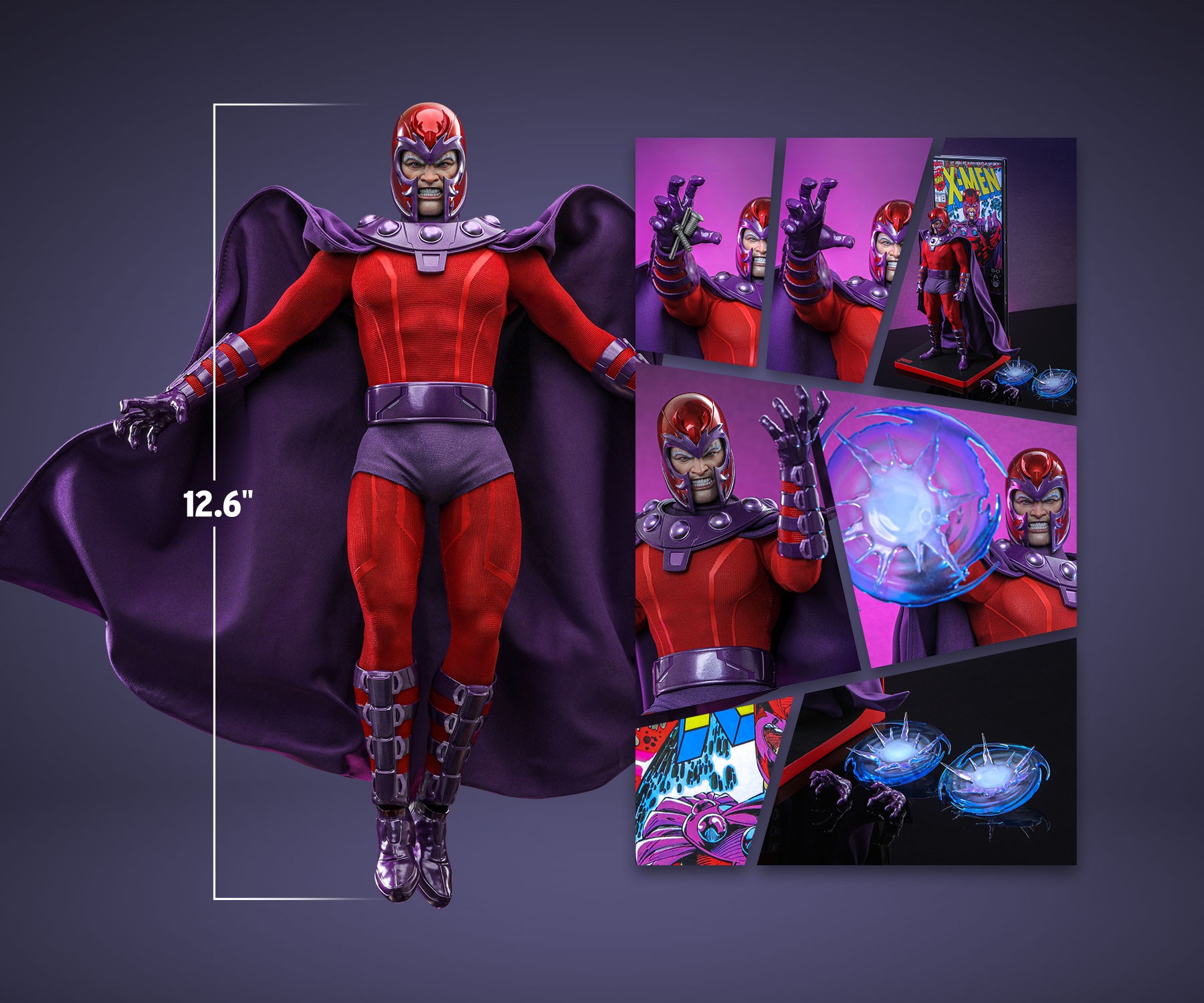
1/6 Hot Toys - HONŌ STUDIO | X-Men - Magneto Action Figure
- Thread starter AlanJG1
- Start date


Help Support Collector Freaks Forum:
This site may earn a commission from merchant affiliate
links, including eBay, Amazon, and others.
Chopper Face
Super Freak
Yeah certainly only some - take Blob being able to attain pique obesity and still function. I just say mutants are able to attain the furthest extremes of human potential more easily.Maybe some mutants, but the Morlocks were a rough looking bunch. Even their leader Callisto was emaciated looking. Shadow King was a fat guy. Even goes back to Toad and Prof. X of course. They were unlucky with their mutant genes.
Us normal humans all have difference response rates to physical training and such so I imagine the X gene to make mutants extra responsive to whatever environment they’re in or processes they put their bodies through.
A well disciplined and regimented guy like Cyclops who trains regularly easily attains the Greek God physique while the already deformed, sewer dwelling Morlocks only become more dishevelled in their subterranean isolation.
Going to hold off on this figure for now, I like it but not as much as wolverine, will wait to see what else they put out.
My biggest gripe with the figure is definitely the damn lines, they look awful and straight out of the MCU.
The worst part is, in the cover art they seem to be referencing heavily, Magneto has lines on his torso, and they look SO much better:

My biggest gripe with the figure is definitely the damn lines, they look awful and straight out of the MCU.
The worst part is, in the cover art they seem to be referencing heavily, Magneto has lines on his torso, and they look SO much better:


This didn’t wow me like Wolverine did. I think I may skip this one and wait to see SooSoo Toy’s version.
Stryker2011
Super Freak
Premier Toys wins imho.
SwedishHeat
Super Freak
- Joined
- Sep 13, 2006
- Messages
- 8,119
- Reaction score
- 886
Going to hold off on this figure for now, I like it but not as much as wolverine, will wait to see what else they put out.
My biggest gripe with the figure is definitely the damn lines, they look awful and straight out of the MCU.
The worst part is, in the cover art they seem to be referencing heavily, Magneto has lines on his torso, and they look SO much better:
View attachment 693530
It's weird how Sideshow and Hono both tried to do the lines on the torso, but it's going in the wrong direction.
Sideshow's flare out from the center of the chest. Hono's taper in from the shoulders. But Jim Lee drew it with them starting from the center of the chest, and wrapping down towards the side.
I can't imagine they got it wrong on accident. I think the issue stems from the fact that Jim Lee draws characters with such broad shoulders and chest, that it only makes sense to draw the lines that way. I think Hono was on to something using the lines to try and accentuate a V-shaped torso, but I think there's just no substitute for an actual broad-shouldered body.
CupcakeMcGraw
Super Freak
- Joined
- Apr 13, 2015
- Messages
- 1,093
- Reaction score
- 176
"The worst part is, in the cover art they seem to be referencing heavily, Magneto has lines on his torso, and they look SO much better"Going to hold off on this figure for now, I like it but not as much as wolverine, will wait to see what else they put out.
My biggest gripe with the figure is definitely the damn lines, they look awful and straight out of the MCU.
The worst part is, in the cover art they seem to be referencing heavily, Magneto has lines on his torso, and they look SO much better:
View attachment 693530
Do they, though?

I often find that when comic book nerds are complaining about panel lines and texture changes on real-life costumes, they always link back to some heavily inked, super dramatic artwork showing insane muscle definition that serves the same purpose as the panel lines- to break up huge swaths of solid color and provide visual interest. The difference being that panel lines can be done in real life, while that level of musculature and definition isn't going to show through any fabric on earth in 1:1 scale, nevermind in sixth scale.
That level of dramatic rendering is always going to look cool; how much heavy lifting is that level of cool doing in regards to forgiveness of other elements?
Are those little torso lines really "SO much better?" It's basically what Sideshow did, and they don't look that great in real life; even in the art they're a little "meh" without all the raging muscles.

Conversely, do HONO's lighter stripes really look so awful if considered alongside the cool factor of great inking? I think they're just as benign as the dark lines, because it's not what your eye is focusing on; you're looking at the muscles first and foremost.

I'm just not convinced that people wanting comic book figures are being realistic about anyone's ability to translate 2D heavily stylized artwork into an action figure like this. Aside from needing muscles big enough and defined enough to cast shadow, you'd also need a super thin fabric that can adhere to every single curve/nook/cranny without an insane amount of wrinkling for any of it to show through. Absent that, panel lines and texture variation are the only way to make these suits less incredibly boring/Spirit Halloweeny in a real space.
Those of you who don't like the lines, I get it (they probably should go with a consistent, visible texture to the suit instead) but without something to break-up the monotony of a constant color, it ends up looking like smooth, 1970's spandex. Unless that's what you really want to see(?).
"The worst part is, in the cover art they seem to be referencing heavily, Magneto has lines on his torso, and they look SO much better"
Do they, though?
View attachment 693830
I often find that when comic book nerds are complaining about panel lines and texture changes on real-life costumes, they always link back to some heavily inked, super dramatic artwork showing insane muscle definition that serves the same purpose as the panel lines- to break up huge swaths of solid color and provide visual interest. The difference being that panel lines can be done in real life, while that level of musculature and definition isn't going to show through any fabric on earth in 1:1 scale, nevermind in sixth scale.
That level of dramatic rendering is always going to look cool; how much heavy lifting is that level of cool doing in regards to forgiveness of other elements?
Are those little torso lines really "SO much better?" It's basically what Sideshow did, and they don't look that great in real life; even in the art they're a little "meh" without all the raging muscles.
View attachment 693831
Conversely, do HONO's lighter stripes really look so awful if considered alongside the cool factor of great inking? I think they're just as benign as the dark lines, because it's not what your eye is focusing on; you're looking at the muscles first and foremost.
View attachment 693832
I'm just not convinced that people wanting comic book figures are being realistic about anyone's ability to translate 2D heavily stylized artwork into an action figure like this. Aside from needing muscles big enough and defined enough to cast shadow, you'd also need a super thin fabric that can adhere to every single curve/nook/cranny without an insane amount of wrinkling for any of it to show through. Absent that, panel lines and texture variation are the only way to make these suits less incredibly boring/Spirit Halloweeny in a real space.
An easy fix would be a body that protrudes out of the suit more, and some airbrush shading on the musculature, which in my opinion should be included on any comic inspired figure.
I do see where you're coming from, it makes sense, different medias. I still don't like them though, on Magneto in particular these look very generic and are too thick and oddly colored imo.
What us "comic book" nerds want is a cool looking figure that looks as close to the source material as possible."The worst part is, in the cover art they seem to be referencing heavily, Magneto has lines on his torso, and they look SO much better"
Do they, though?
View attachment 693830
I often find that when comic book nerds are complaining about panel lines and texture changes on real-life costumes, they always link back to some heavily inked, super dramatic artwork showing insane muscle definition that serves the same purpose as the panel lines- to break up huge swaths of solid color and provide visual interest. The difference being that panel lines can be done in real life, while that level of musculature and definition isn't going to show through any fabric on earth in 1:1 scale, nevermind in sixth scale.
That level of dramatic rendering is always going to look cool; how much heavy lifting is that level of cool doing in regards to forgiveness of other elements?
Are those little torso lines really "SO much better?" It's basically what Sideshow did, and they don't look that great in real life; even in the art they're a little "meh" without all the raging muscles.
View attachment 693831
Conversely, do HONO's lighter stripes really look so awful if considered alongside the cool factor of great inking? I think they're just as benign as the dark lines, because it's not what your eye is focusing on; you're looking at the muscles first and foremost.
View attachment 693832
I'm just not convinced that people wanting comic book figures are being realistic about anyone's ability to translate 2D heavily stylized artwork into an action figure like this. Aside from needing muscles big enough and defined enough to cast shadow, you'd also need a super thin fabric that can adhere to every single curve/nook/cranny without an insane amount of wrinkling for any of it to show through. Absent that, panel lines and texture variation are the only way to make these suits less incredibly boring/Spirit Halloweeny in a real space.
Last edited:
There's the rub!What us "comic book" nerds want is a cool looking figure that looks as close to the source material as possible.
CupcakeMcGraw
Super Freak
- Joined
- Apr 13, 2015
- Messages
- 1,093
- Reaction score
- 176
So then would you say you've already gotten that with Magneto, in the Sideshow version?What us "comic book" nerds want is a cool looking figure that looks as close to the source material as possible.

jedijim3002
Super Freak
- Joined
- Apr 22, 2010
- Messages
- 12,429
- Reaction score
- 1,298
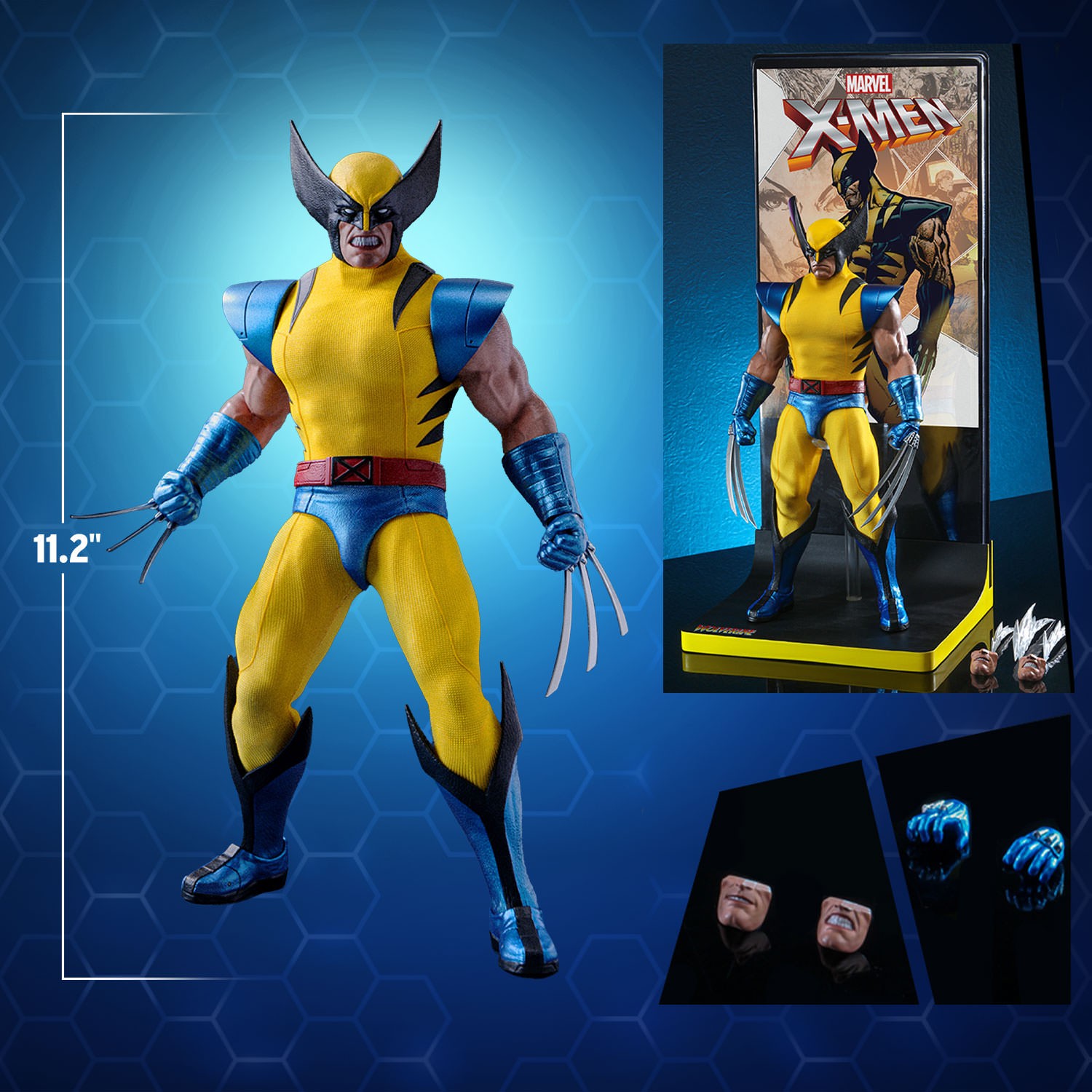
Hard to tell exactly the height between these two but I think this mock up is fairly close. Not the same angle so probably not accurate but seems like it could be close enough.


jedijim3002
Super Freak
- Joined
- Apr 22, 2010
- Messages
- 12,429
- Reaction score
- 1,298
If you know anything about Hot Toys or have been collecting a while you know those measurements are never accurate.I think this was shown before...
Garlador
Super Freak
- Joined
- Feb 18, 2022
- Messages
- 1,604
- Reaction score
- 2,394
Ah, but see, this is “HONO”. Totally different. Ignore the fake mustache and glasses.If you know anything about Hot Toys or have been collecting a while you know those measurements are never accurate.
Ah, but see, this is “HONO”. Totally different. Ignore the fake mustache and glasses.
Choward Han would disagree.

Yes and no. I like the overall design, minus the stripes. but I hated the body SS game him. Unless you missed the SS release, I personally didn't see a need for another Magneto, let alone 3.So then would you say you've already gotten that with Magneto, in the Sideshow version?
View attachment 693890
Similar threads
- Replies
- 353
- Views
- 27K
- Replies
- 194
- Views
- 5K
- Replies
- 44
- Views
- 3K
- Replies
- 60
- Views
- 6K
Latest posts
-

-

-
 InArt: The Lord of the Rings - Gandalf 1:6
- Latest: Godfather1408
-

-
Hot Toys Back to the Future event April 20th, 2024
- Latest: Godfather1408