If you like the statue that's fine with me, I don't care what other people think either way, however, you offer your personal thoughts towards and evoked by the piece almost as if they are facts overlooked by those who take issue with it, and they're not fact.
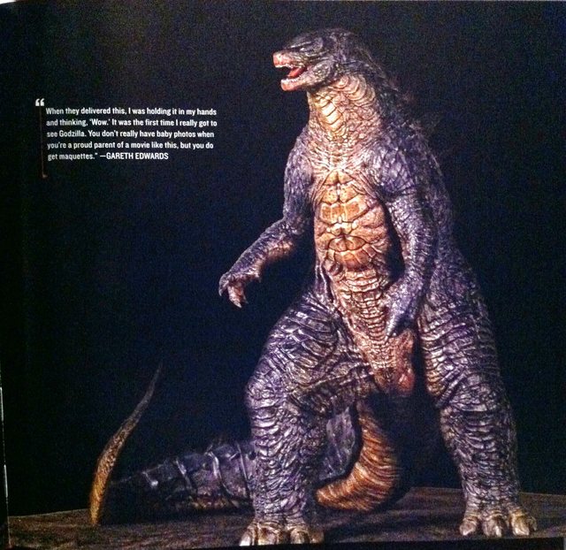
I agree with you that some of the descriptions of the base, people offer criticism with ridiculous words but the reasoning behind them isn't so ridiculous. Box of kitty litter is farfetched, but, the debris of it is very minimalistic and hardly and pieces standing out a building chunks, more dirty and rock, and I think many would prefer something with pieces of building still standing and elements that make you feel like he's standing among the ruins of a city. If you choose to believe the base represents something particular, that's fine, the fun of collecting is injecting our own thoughts into what we see and adding to our personal value, but, Sideshow's official description is "Dominating over a landscape reduced to rubble with his atomic roar..." and nothing in there defines it as rubble of a nuclear reactor. Honestly, considering this piece does come off more like a museum piece to embody the character, I almost feel like the base on the new statue would be more fitting for this and this base more fitting for that piece with its action oriented pose.
"To begin with, the monochromatic color scheme is inspired. The even gray tone with subtle shading allows intricate detail to be plainly visible, also reinforcing the psychological idea that the piece belongs in a museum rather than a toy shop (statues in a museum aren’t painted to look like garish action figures)."
Not sure what's inspired about it, but, it's not film accurate and as demonstrated by the photo study recently in this thread, it doesn't pop the details very well unless you have the right lighting conditions, conditions which aren't necessarily standard for home display location. The simpler paint scheme might play better of the detail were sharper like the new statue, but as softened as the fine details are, paint work the brings out all that detail would make it more effective under any lighting scenario. I also highly disagree that this paint scheme sets it at museum quality and something else would venture into toy realm.
I could easily see these in a museum and they are not monochromatic.
"Most importantly, the bleak color scheme is both logically and thematically astute. Godzilla looks as if his hide has been dusted with radioactive soot… which makes perfect sense, considering that he’s standing on the debris of a destroyed nuclear facility. G at his best is an anti-nuke icon, a walking metaphor for atomic devastation. This maquette captures that idea better than any Godzilla collectible I’ve ever seen… even better than the recent movie, which shifts the dread for most of its running time to less interesting MUTOs. Here, the Big G is front and center, at the heart of a somber apocalypse. It’s the best possible use of this character, imo."
First off, what distinguishes radioactive soot from any soot besides personal viewpoint and once again wanting to see it as him standing on a destroyed nuclear facility? As I mentioned already, if you want to see it this way, fine, but it's very logical for others to not care for the base or soot effect because to them it is no the things you choose to see it as. Had Sideshow specifically said this is the situation being depicted, maybe more people would feel like you, but it's a generic debris base and a soot looking paint scheme, which in any debris situation makes sense, but would still ideally be worked into an overall paint scheme that pops the sculpt work and captures the design the piece is based on. I also don't see how this represents the metaphor Godzilla was created to stand for, I think the overall pose captures a sense of his power and him being above everything, but he comes off like a powerful, giant animal, not so much nuclear weapons on two legs.
"We should remind ourselves that 1954’s GOJIRA remains the strongest Godzilla movie because it presents its scorched earth warning in appropriately somber tones, just as this maquette does. Every now and then unsophisticated G fans suggest colorizing Honda’s classic, showing just how oblivious they are to the wisdom of using bleak color (or even non-color) to drive home a devastatingly bleak message. On the other statue thread, someone even re-painted this maquette in joyous Christmas tree hues, with vibrant blues, golds, and silvers. Not surprisingly, fans who deemed the original version “unpainted” were ecstatic. Forget the deeper meanings art can inspire, who cares about the appropriately somber end of days warning… pretty colors that dazzle the eye are what many unsophisticated SS collectors prefer. Poor Sideshow. It must be tough trying to create art when many of their customers want toys."
I'm not sure where you've seen this crazy colored paint scheme, I follow every Godzilla thread here and most that would mention such a thing at Tohokingdom or reddit and have never seen it. I don't think anyone in this thread who wants an enhanced paint job on this piece would ever feel Gojira needs to be colored, the black and white is what makes it what it is, and if anything, I personally would like to see a black and white Godzilla once again. That said, part of what works about Gojira is that because it was black and white, the lighting often has a very strong and powerful contrast level, deep blacks and vibrant whites, it's extremely cinematic.
NECA painted their Gojira black and white. Under the right lighting conditions, it's no more visually powerful than a colored figure.
If anything, people looking for enhanced paint work are looking for the paint to compensate for the lack of cinematic lighting in the home and make the piece pop in ways the camera might do for the simple painted suit or CGI model.
It's also a matter of personal taste, some collectors may feel like you and want the piece to have an emotional feel to it that may benefit from a particular paint scheme. Others, buying an expensive piece based specifically on a design and being sold for representing that design, want it as close to the source as possible.
Granted, there's no chance of getting a mass production piece painted to the level of detail as a CGI model, but it's clearly not a monochromatic design.
"Final comments: For God’s sake, haters, take a look at the exquisitely sculpted arms, hands and shoulders of this maquette. Michelangelo would be impressed! Add to these artistic pleasures that gloriously upturned head, overall dramatic power, and figure-to-base thematic punch. Accept the fact that a monochromatic kaiju monster is painted monochromatically, but that this subdued, ashen color scheme is used to make a powerful anti-nuke statement that is 100% appropriate to the character, and elevates the piece’s artfulness. I may not have cared much for the movie it is based on, but being a Gojira fan since childhood, I absolutely adore this maquette and am so pleased that I own one."
For someone who opens with a statement like this "Everyone interprets what they see differently, of course. I’ve read all the complaints posted on this thread, and, well, I simply couldn’t disagree more. Since we’re all entitled to our views, here is mine…"
Your overall post comes off a bit close minded, reading like "are you people blind" and wanting to point out all the things people are "missing" to be hating on this piece.
You offer some great reasons and ways to take joy in this piece and I'm sure the views are shared by plenty, but you have to also accept that having a negative outlook on this piece is not without merit.
Regardless, I do agree with you that on the negative side, there are those who can't articulate an opinion beyond the argument level of a 5th grader, but there's plenty of room for well thought out and reasoned complaints against this piece.


") There are alot of personal opinions being asserted as 'fact' on these forums and it's becoming tedious.
There are alot of personal opinions being asserted as 'fact' on these forums and it's becoming tedious.