Still don't get the articulation complaints. It is way better than the old MK 3s, which most people liked at the time. I think it has all you need. And I kinda like the swap out ab section instead of actual movement because it's more solid and you probably wouldn't be able to achieve that much of a "crunch" otherwise.
You are using an out of date browser. It may not display this or other websites correctly.
You should upgrade or use an alternative browser.
You should upgrade or use an alternative browser.
MMS Diecast - Iron Man: 1/6th scale Mark III Collectible Figure
- Thread starter Jaycepticon
- Start date


Help Support Collector Freaks Forum:
This site may earn a commission from merchant affiliate
links, including eBay, Amazon, and others.
Manannin
Super Freak
Still don't get the articulation complaints. It is way better than the old MK 3s, which most people liked at the time. I think it has all you need. And I kinda like the swap out ab section instead of actual movement because it's more solid and you probably wouldn't be able to achieve that much of a "crunch" otherwise.
I agree, but people love to find any detail to latch on to as a reason to hate it seems. Like I said a few posts back, I don't think any of the complaints matter in hand except I would personally like a bit of ankle pivot as some poses feel kind of unstable as the foot isn't planted on the floor properly. But if that is my only complaint (and it is!) I am very happy with it. And I got the EX, so the little silver sticker makes all the difference

kiwiatlarge
Super Freak
- Joined
- Nov 24, 2013
- Messages
- 2,750
- Reaction score
- 55
Honestly, the only MCU figure I have that seems to have really good articulation is Mk43. Widow is very restrictive. Hawkeye has good posing, Thor has some movement. Loki and Cap feel restricted by clothing. I haven't tested Mk3 because he has been in HoA pose ever since I unboxed him, but he isn't going to be worse than most of my figures.
Still don't get the articulation complaints. It is way better than the old MK 3s, which most people liked at the time. I think it has all you need. And I kinda like the swap out ab section instead of actual movement because it's more solid and you probably wouldn't be able to achieve that much of a "crunch" otherwise.
Because time changed and we know HT can put more effort by giving us ankle & torso articulation.
Imagine a mark 3 figure that has excellent articulation which also can do a landing pose

Maybe this will give them a reason to make another mk3 in quarter scale
Motuxmen
Super Freak
- Joined
- Feb 13, 2014
- Messages
- 12,312
- Reaction score
- 118
Because time changed and we know HT can put more effort by giving us ankle & torso articulation.
Imagine a mark 3 figure that has excellent articulation which also can do a landing pose
Maybe this will give them a reason to make another mk3 in quarter scale
Yeah, becuase this one is only the best at this pose. Total slackers.
And saying they did what they did becuase of a lack of effort, just becuase you want something else is insulting and baseless.
Had they stuck with the same old methods and designs of other figures it would have been less work..but they re-designed this figures articulation which took MORE effort, not less. And given there are fairly even numbers of people who like the torso and those that dislike it there is no right and wrong..only what you individually prefer. Which is fine.
But your whole argument is flawed. A copy and paste design requires less effort, and would have resulted in a worse landing pose.
Chill down man....
I'm not saying they stuck with old methods. Read my past posts and you'll read that I said this figure is a must have. But what I'm saying is, they could have give us more articulation which they also already did with past iron man figures. It's not like I'm asking for something new, but more like something that should've been there. At least the ankle could've been better and wouldn't hurt the realism of the figure.

MarvelZombie
Super Freak
Great pic SkyRay!
Yeah, becuase this one is only the best at this pose. Total slackers.
And saying they did what they did becuase of a lack of effort, just becuase you want something else is insulting and baseless.
Had they stuck with the same old methods and designs of other figures it would have been less work..but they re-designed this figures articulation which took MORE effort, not less. And given there are fairly even numbers of people who like the torso and those that dislike it there is no right and wrong..only what you individually prefer. Which is fine.
But your whole argument is flawed. A copy and paste design requires less effort, and would have resulted in a worse landing pose.
Why are you defending this figure so much?
The figure iMO is not as good as should be or compared to other recently released HT figures.
After some weeks with the figure in hand here are my thoughts.
Cons
Proportions are off comparing to all shot in the film and promo pictures.
Figure is too short and it makes it looks like a culturist dwarf. I´m not comparing with any other armor in this point, just comparing proportions to a human body standards.
Chest is too bulky and with wrong shape in some parts (frontal plane for example. The angles should be sharper and more defined as in the old Mk3, not rounded and soft as this one have)
Shoulder pads are too big.
Arms/shoulders are also too separate giving the poses a M shape that looks sooo unatural.
Color is off to compared to film.
Too glossy.
Helmet detail is off (red rectangle primarly)
Ankle articulation is a S"*it
Panties center part is too slim and short.
Hips are too wide.
Legs to separated.
Chest non existant articulation also dont let us to pose it in a natural way different than a wood block.
Low % of diecast parts.
Pros
paint application and overal quality
Joints stiffness and knee articulation
Detachable parts well implemented, also face mask lower magnet
I cant find more, sorry...
Now please tell me if i´m wrong with my afirmations.
I dont see them as subjective afirmations. Are facts provable with any comparition shot with film footage.
And please, dont tell me that Marvel wanted to change those things as long as they approved other past IM with much less "issues"
I dont know the reason why HT made this version of mk3, just basing on the result that for this iconic and very expected specific armor is off.
And i´m not trying to blame HT or anyone. I´m just dissapointed with this figure i waited for sooooo long.
All color, shapes and proportions should have been based on film, that should be for sure the goal of every MOVIE MASTER PIECE figure. Not based in "the color tony would desired", in the color or shapes marvel want to approve or all this kind of arguments i have heard.
BTW, mine is for sale
")
Brainiac
Super Freak
Why are you defending this figure so much?
The figure iMO is not as good as should be or compared to other recently released HT figures.
After some weeks with the figure in hand here are my thoughts.
Cons
Proportions are off comparing to all shot in the film and promo pictures.
Figure is too short and it makes it looks like a culturist dwarf. I´m not comparing with any other armor in this point, just comparing proportions to a human body standards.
Chest is too bulky and with wrong shape in some parts (frontal plane for example. The angles should be sharper and more defined as in the old Mk3, not rounded and soft as this one have)
Shoulder pads are too big.
Arms/shoulders are also too separate giving the poses a M shape that looks sooo unatural.
Color is off to compared to film.
Too glossy.
Helmet detail is off (red rectangle primarly)
Ankle articulation is a S"*it
Panties center part is too slim and short.
Hips are too wide.
Legs to separated.
Chest non existant articulation also dont let us to pose it in a natural way different than a wood block.
Low % of diecast parts.
Pros
paint application and overal quality
Joints stiffness and knee articulation
Detachable parts well implemented, also face mask lower magnet
I cant find more, sorry...
Now please tell me if i´m wrong with my afirmations.
I dont see them as subjective afirmations. Are facts provable with any comparition shot with film footage.
And please, dont tell me that Marvel wanted to change those things as long as they approved other past IM with much less "issues"
I dont know the reason why HT made this version of mk3, just basing on the result that for this iconic and very expected specific armor is off.
And i´m not trying to blame HT or anyone. I´m just dissapointed with this figure i waited for sooooo long.
All color, shapes and proportions should have been based on film, that should be for sure the goal of every MOVIE MASTER PIECE figure. Not based in "the color tony would desired", in the color or shapes marvel want to approve or all this kind of arguments i have heard.
BTW, mine is for sale
Its unfortunate, I as well have waited years to get a new and updated MK3. It was the one armor I always wanted since I started even collecting Hot Toys many years ago. Its a shame that the cons outweigh the pros by far and I never thought HT would take backwards steps on this after all the armors they've done right in the past few years,its very disappointing. My only hope now is a 1/4 scale MK3 from them,I pray they knock it out of the park.Awesome work/customs by the way Inigou!
And what the hell happened to Yankee Planet??
I just rewatched the movie last night.
You're right, at least I can tell quickly that the color is off.
Despite that, I'm happy with this figure. It still looks good. I'm sure hot toys will eventually make mk 3 in quarter scale years from now
You're right, at least I can tell quickly that the color is off.
Despite that, I'm happy with this figure. It still looks good. I'm sure hot toys will eventually make mk 3 in quarter scale years from now
sunnycrowe
Freakzoid
- Joined
- Jan 3, 2015
- Messages
- 65
- Reaction score
- 3
Color and glossy carpaint finish is way off.. But the paintwork is nicely done it becomes a great display piece anyway. Chest pops out too much. But as of all other IMs, the paintwork is glossy (except for bd mk3)
Best paintwork with metal like finish so far is the 1/4 mk43 prototype.
Best paintwork with metal like finish so far is the 1/4 mk43 prototype.
Craig Walker
Super Freak
Wow, didn't know it sucked until I read it here. 
I think it looks great. I wanted the classic IM look, and I feel it delivers.
I think it looks great. I wanted the classic IM look, and I feel it delivers.
Motuxmen
Super Freak
- Joined
- Feb 13, 2014
- Messages
- 12,312
- Reaction score
- 118
Yes those are opinions, not fact. Not affirmations.Why are you defending this figure so much?
The figure iMO is not as good as should be or compared to other recently released HT figures.
After some weeks with the figure in hand here are my thoughts.
Cons
Proportions are off comparing to all shot in the film and promo pictures.
Figure is too short and it makes it looks like a culturist dwarf. I´m not comparing with any other armor in this point, just comparing proportions to a human body standards.
Chest is too bulky and with wrong shape in some parts (frontal plane for example. The angles should be sharper and more defined as in the old Mk3, not rounded and soft as this one have)
Shoulder pads are too big.
Arms/shoulders are also too separate giving the poses a M shape that looks sooo unatural.
Color is off to compared to film.
Too glossy.
Helmet detail is off (red rectangle primarly)
Ankle articulation is a S"*it
Panties center part is too slim and short.
Hips are too wide.
Legs to separated.
Chest non existant articulation also dont let us to pose it in a natural way different than a wood block.
Low % of diecast parts.
Pros
paint application and overal quality
Joints stiffness and knee articulation
Detachable parts well implemented, also face mask lower magnet
I cant find more, sorry...
Now please tell me if i´m wrong with my afirmations.
I dont see them as subjective afirmations. Are facts provable with any comparition shot with film footage.
And please, dont tell me that Marvel wanted to change those things as long as they approved other past IM with much less "issues"
I dont know the reason why HT made this version of mk3, just basing on the result that for this iconic and very expected specific armor is off.
And i´m not trying to blame HT or anyone. I´m just dissapointed with this figure i waited for sooooo long.
All color, shapes and proportions should have been based on film, that should be for sure the goal of every MOVIE MASTER PIECE figure. Not based in "the color tony would desired", in the color or shapes marvel want to approve or all this kind of arguments i have heard.
BTW, mine is for sale
The chest is to wide and the hips to narrow? Compared to what? Not the real suit.
Yes, ankle articulation is limited. Which makes it accurate to the design.
The shoulders have gaps? You mean, so they can move? I thought you wanted more articulation. Same deal with the legs and hips. You complain about them not changing the design to add articulation in some spots, but complain they did in others. Which is fine, but is still an opinion, not some law or fact.
Yes, the paint is not accurate to every version of the suit in the film. Mainly becuase there are multiple paint apps...and no matter what one they went with it wouldn't match them all, unless it could color change. We already got the super dark red and it was universally disliked and people complained.
ankle articulation on nearly every figure is limited. War machine, mk4, heartbreaker, Thor, ect. Show me a pose where you need the ankle to move right to left.
As for this being a wood block...that's just stupid. This can be posed in any pose Thor, cap, hulk, most iron man figures, storm troopers, wolverine, falcon, terminator, batman can do. But sure, wood block. That comment is why I "defended" the figure. And I don't see anyone chiming in on the ten other posts before mine that "defended" the figure.
Craig Walker
Super Freak
^ Agreed. If it's not for you, fine.
Don't bash others who like it.
Don't bash others who like it.
Plastic Bateman
Super Freak
Why are you defending this figure so much?
The figure iMO is not as good as should be or compared to other recently released HT figures.
After some weeks with the figure in hand here are my thoughts.
Cons
Proportions are off comparing to all shot in the film and promo pictures.
Figure is too short and it makes it looks like a culturist dwarf. I´m not comparing with any other armor in this point, just comparing proportions to a human body standards.
Chest is too bulky and with wrong shape in some parts (frontal plane for example. The angles should be sharper and more defined as in the old Mk3, not rounded and soft as this one have)
Shoulder pads are too big.
Arms/shoulders are also too separate giving the poses a M shape that looks sooo unatural.
Color is off to compared to film.
Too glossy.
Helmet detail is off (red rectangle primarly)
Ankle articulation is a S"*it
Panties center part is too slim and short.
Hips are too wide.
Legs to separated.
Chest non existant articulation also dont let us to pose it in a natural way different than a wood block.
Low % of diecast parts.
Pros
paint application and overal quality
Joints stiffness and knee articulation
Detachable parts well implemented, also face mask lower magnet
I cant find more, sorry...
Now please tell me if i´m wrong with my afirmations.
I dont see them as subjective afirmations. Are facts provable with any comparition shot with film footage.
And please, dont tell me that Marvel wanted to change those things as long as they approved other past IM with much less "issues"
I dont know the reason why HT made this version of mk3, just basing on the result that for this iconic and very expected specific armor is off.
And i´m not trying to blame HT or anyone. I´m just dissapointed with this figure i waited for sooooo long.
All color, shapes and proportions should have been based on film, that should be for sure the goal of every MOVIE MASTER PIECE figure. Not based in "the color tony would desired", in the color or shapes marvel want to approve or all this kind of arguments i have heard.
BTW, mine is for sale
Pretty much all of this. Glad someone braver than me was finally willing to point out it's the wrong colour.
You're also right about the chest and shoulders, looking at that pic.
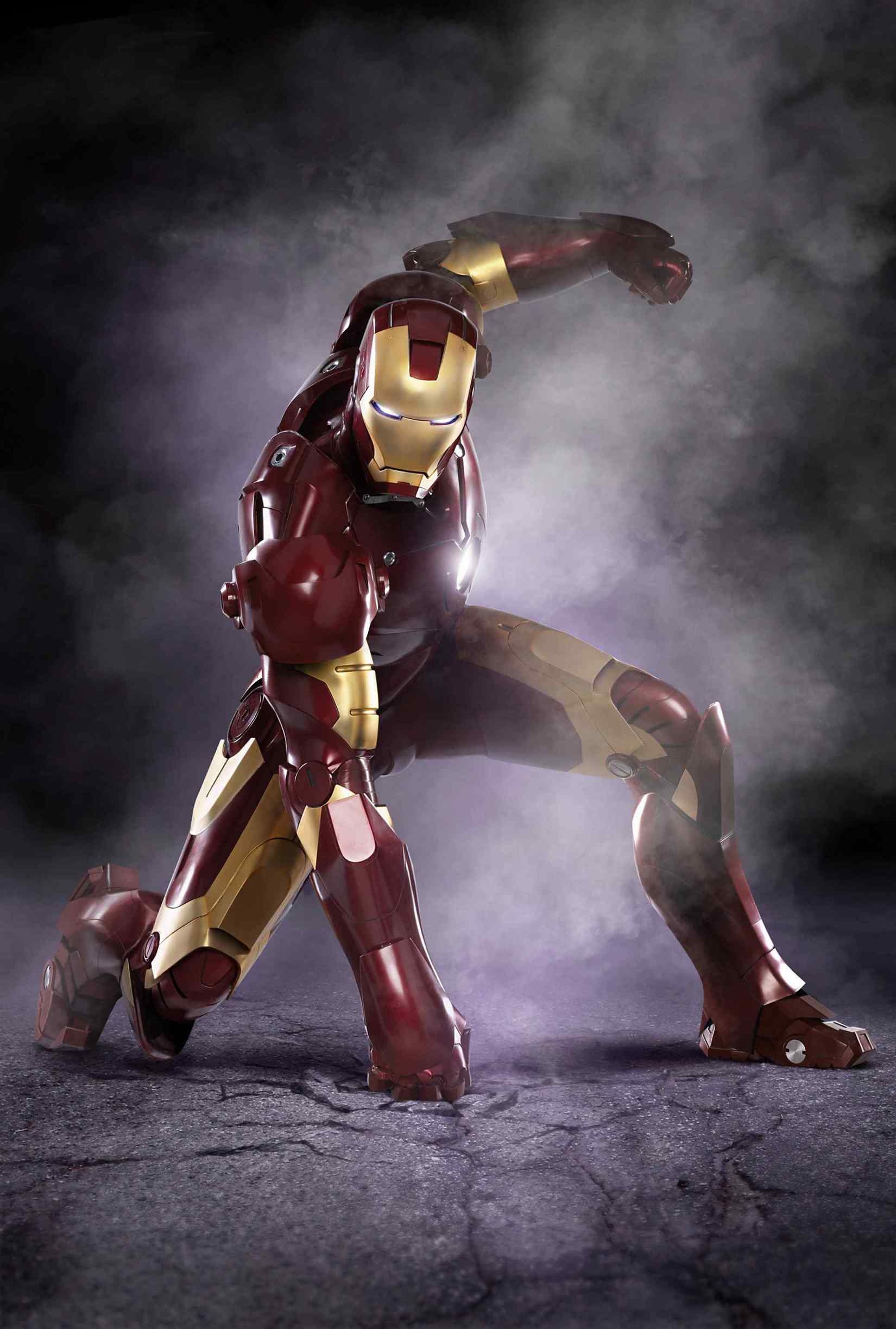
Oh, and just look at that. Sideways ankle articulation. On the actual screen-used suit, no less.
I swear half the people in this thread have forgotten what the Mk III actually looked like

I'm typing this just to have a healthy discussion between collectors, please let all be civil.
My main concern is only about the articulation mostly. So about the ankle, I agree it's true to the design, yet hot toys gave us a mechanism where we can pull the bottom of the feet slightly with their latest iron man figures.
Collectors will benefit from this mechanism if they're going to pose it with a bit of wide stance. If they're not going to let us pose iron man using wide stance, they wouldn't make the side of the panties to be able to go up.
Lets take a look at the shoulder joint. To achieve better articulation, they made it so it can be pulled out. What hot toys did with mk 42 for example wasn't true to the original suit design, but they did it anyway.
By doing this, collectors can also push it back if they want a more realistic look.
So it will be a win win situation for everyone. Yet they're not doing it with this mk 3
So what I mean is this, they step backwards with the articulation with this figure. Not all will like it, including me. Now if I'm asking hot toys to make an iron man figure that can fly and I'm complaining they didn't tried their best, you can say I'm being ridiculous.
I hope at least this will end the debate why some people complained about the articulation.
spindrift
Super Freak
- Joined
- Apr 26, 2009
- Messages
- 13,328
- Reaction score
- 121
Yes those are opinions, not fact. Not affirmations.
The chest is to wide and the hips to narrow? Compared to what? Not the real suit.
Yes, ankle articulation is limited. Which makes it accurate to the design.
The shoulders have gaps? You mean, so they can move? I thought you wanted more articulation. Same deal with the legs and hips. You complain about them not changing the design to add articulation in some spots, but complain they did in others. Which is fine, but is still an opinion, not some law or fact.
Yes, the paint is not accurate to every version of the suit in the film. Mainly becuase there are multiple paint apps...and no matter what one they went with it wouldn't match them all, unless it could color change. We already got the super dark red and it was universally disliked and people complained.
ankle articulation on nearly every figure is limited. War machine, mk4, heartbreaker, Thor, ect. Show me a pose where you need the ankle to move right to left.
As for this being a wood block...that's just stupid. This can be posed in any pose Thor, cap, hulk, most iron man figures, storm troopers, wolverine, falcon, terminator, batman can do. But sure, wood block. That comment is why I "defended" the figure. And I don't see anyone chiming in on the ten other posts before mine that "defended" the figure.
Absolutely agree with you- I see NOTHING "off" on the figure- it looks terrific and the paint/color is an interpretation of different hues/shades seen in the film- hard to please everyone but the original BD III was attacked just as much on color. . The articulation(or lack of,according to some) in the abs and ankles is blown WAY out of proprtion....
Similar threads
- Replies
- 146
- Views
- 17K
- Replies
- 6
- Views
- 428
- Replies
- 60
- Views
- 6K
- Replies
- 25
- Views
- 3K