MMS Diecast - Iron Man: 1/6th scale Mark III Collectible Figure

Collector Freaks Forum

Help Support Collector Freaks Forum:

This site may earn a commission from merchant affiliate links, including eBay, Amazon, and others.
They are some interesting pictures Motux. Where did you see the suits? I love seeing that stuff...

When I went for my interview for my current job (5 years ago now) they had the Stan Winston Mark I suit displayed in the lobby, it was awesome! Not what I was expecting to see on a job interview, but it helped me decide to take the job!
 
i feel like maybe it is lighter to match the color of the cartoons. marvels call. on any toys, you never see maroon they are all red.

there is no way HT would be able to do something without direct input from Marvel or who ever the powers be.

That was my complaint, the red made it look like a cheap toy. I wasn't paying $310 for a cartoon version of the Mark 3.

And if you look next to it. The mk42 suit. And the red is nearly identical. I'm sure there will be some person to post some dark version now. Which is not the point. If there are so many variations on screen then hot toys can use any one of them, and it's "right".

How hard is it to understand that it looks too bright to a lot of people and they don't care for it? Was it your decision to paint this figure or something? You are taking this way too personally on behalf of a giant, wealthy company. You are trying to beat up the ocean right now. I put this figure on my shelf and it was a noticeably brighter red than every one of them- instead of being the old Mk3 darker than every figure, it was brighter than every figure. I probably would have been fine it it was the same red as the rest of the lineup, but it wasn't. I didn't like the look at all, so I got rid of it. Maybe it was a bold, stylistic choice on Hot Toys behalf and maybe Marvel's CEO personally directed them to change the color but that doesn't change the fact that I still think it looked bad and wasn't worth my money.


aVAeXFi.jpg


kpZyIF4.jpg
 
i agree with everyone....the thing is that Marvel chose the color not HT. They made the call. I have a hard time thinking HT is given free reign to change the color of a Marvel property just because. Even the non-canon armor like the blue stealth MkIII needs marvels permission.

so people can go back and forth all day, it isn't HTs fault. I just cannot believe that marvel didn't ultimately sign off, knowing full well this was lighter.
 
I understand people think it's to light. Why would I be saying anything otherwise. Personal preference isn't what I'm talking about. I'm discussing, with someone who ASKED, if it's screen accurate. Some people like the black mk7, but that doesn't mean it's "right". I've not once addressed the personal preference. But the argument that it's "wrong". Or hot toys should have done this or that becuase it looked that way in this scene.

As for your whole premise...that I can't argue on behalf of it being right becuase it's preference....well doesn't hot toys and marvels preference get a say so? People like to have it every way. They argue screen accuracy, but then when it's pointed out that it is screen accurate to some of th film...well then it's preference, and no one can say anything about that.

I'm addressing specific points that put out on a public discussion board.
 
They are some interesting pictures Motux. Where did you see the suits? I love seeing that stuff...

When I went for my interview for my current job (5 years ago now) they had the Stan Winston Mark I suit displayed in the lobby, it was awesome! Not what I was expecting to see on a job interview, but it helped me decide to take the job!

I think that's from one of disneys traveling shows. I don't recall to be honest. But I worked on the film (I've said it before years ago on here, so no I'm not just saying now for the sake of my argument). My father was a friend of Stans. He Taught at the school(still does time to time). I can remember going to the studio when they where working on T2 and having one of my dad's friend scare me so bad I almost peed on myself. He was a 6ft 7 guy and www chasing me around with this messed up Arnold head. Lol I've been around this stuff most of my life. I swore id never do anything art or film as a job. I moved out when I was really young and had a rocky releationship with my mom. Hated the art world. Got into sports and joined the military. But, eventually I ended up doing exactly what I said I wouldn't. Lol

That's a pretty cool thing to see at a job interview. What type of work is it? I'm guessing not like fast food or Walmart.
 
I actually laughed while reading the part about being chased by someone with a messed up Arnie head (sorry!). I would have killed to see that stuff.

But yeah, not Walmart, it was in one of Disney's corporate offices in London. The guy actually said that I could take it on my way out if I could move it, but I decided he was probably joking so best not to try...

That's cool man. I'd have probably tried to take it. Lol

No worries on the laugh. Lol the guy still messes with me about it. We laugh about it often.
 
Some people can't see the forest for the trees. Or did I use that expression wrong? Anyway, there's a difference in being a blind consumer and simply enjoying something for what it is. And then there's the diehards.

Personally, I'm not bothered by the color in the slightest. In fact, I may prefer it, despite this being a whopping $300 figure. After all, Tony Stark himself directly requested "hot rod red" in the film, which is not that far off from candy apple red, depending on the manufacturer of the paint. In some cases it's actually a vibrant hue.

Neither of these colors appears to be what's in the film though. Instead we have a kind of burgundy red. I do think it would be interesting to see a battle-damaged version with interchangeable non-damaged parts that more resembled the burgundy, if only to appease the most stern of collectors.
 
So many custom RDJ full head sculpts on ebay to choose from. Can anyone recommend a specific one that also fits without major modification?
 
Some people can't see the forest for the trees. Or did I use that expression wrong? Anyway, there's a difference in being a blind consumer and simply enjoying something for what it is. And then there's the diehards.

Personally, I'm not bothered by the color in the slightest. In fact, I may prefer it, despite this being a whopping $300 figure. After all, Tony Stark himself directly requested "hot rod red" in the film, which is not that far off from candy apple red, depending on the manufacturer of the paint. In some cases it's actually a vibrant hue.

Neither of these colors appears to be what's in the film though. Instead we have a kind of burgundy red. I do think it would be interesting to see a battle-damaged version with interchangeable non-damaged parts that more resembled the burgundy, if only to appease the most stern of collectors.

Been two of those already. And when they came out people complained it was to dark. Lol
 
Monitor calibration maybe be another factor. It can be the same movie stills we're looking at, but all from our uncalibrated screens.
Characters take on different colors due to lighting conditions, saturation, contrast, color values during post-process.

pzLElP6.jpg

Personally I find AOU scenes processed with too much yellow cast

Just food for thought.
 
This is very true. But that's why I posted photos of the suit. They should both be off by the same amount.

And lighting is a HUGE factor in person and when the photo is taken. It's funny...the camera process images very differently then our brain. It's amazing we see much of anything, sense we don't actually see the onjects(only the light that does or doesn't bounce off it).

But as I said before, most the films have subtle shades on the suits. Even the mk4 and 6 had ****s painted multiple ways. But it just wasn't as wide a spectrum as the mk3. And that's main becuase it was the first film and the early stuff was as much a trial run as anything else. It was changed multiple times. And there are hero suit pieces that are painted with the exact same paint code (there's going to be minor variations depending on who made the paint and the base and way it's applied) that Stan Winston Studios used and mk3dc from hot toys. They used the same color. It may not be a perfect match to some screen grabs, or some props. My point has been, especially with this suit, there's just no "right" in regards to screen accurate. Personal preference is a different issue. But the versions hot toys created, all three, with regard to color are correct. They tried it dark. People complained for years. All they wanted was an updated, diecast, with larger proportion, and lighter red. So hot toys makes it, and now it's to light, to thick, and the articulation sucks. Even though it has 10 more points of articulation then the first suit, and no one complained about its articulation. Lol
 
They tried it dark. People complained for years. All they wanted was an updated, diecast, with larger proportion, and lighter red. So hot toys makes it, and now it's to light, to thick, and the articulation sucks. Even though it has 10 more points of articulation then the first suit, and no one complained about its articulation. Lol

Well, people want improvements. Not some improvements with steps back.
I think there is an in between too dark and too light, Too skinny and too bulky etc. I think they exaggerated both. Is lighter that all IM figures i have.
Also the articulation is worst in the ankles. Coming from mk iv/v/vi/vii etc, this is dissapointing. I cant imagine a reason for it.

And regarding the torso articulation, people would preferred almost the mk IV/VI/VII style or the better one MK 42/43. I dont mind the torso fixed at all but i understand would be better than actual with any articulation for most of the customers.

Also the shoulders should be closer each other but with the system they used for MK 42/43 to pop out them when needed.
It would gave the figure a more natural look for almost every pose.
They had the technology to do it but i can understand why they didnt. Probably to reduce costs just modding the old desing instead developing or adapting the new one? Who knows...
Reducing costs but with similar final price. Good bussines :)

And the helmet top red rectangle? Is this an improvement? No discussion they have invented a new shape for it with no aparent reason. Why?? Old mk 3 has the correct shape there and IMO, the head is a very important part in a figure. The most, really. Just leaving the shape a bit narrower and longer would have been perfect.
 
Got my dieceast Iron Man Mk.III a couple of days ago. The sculpt, the paintjob, and all the attention to details really makes this a beautiful figure! At first I was a bit disappointed in the limited articulation, but I soon decided to use the twisted waist section and for once try on the ground punch/landing pose. It took a bit of fiddling, but I think I got it close enough. :)


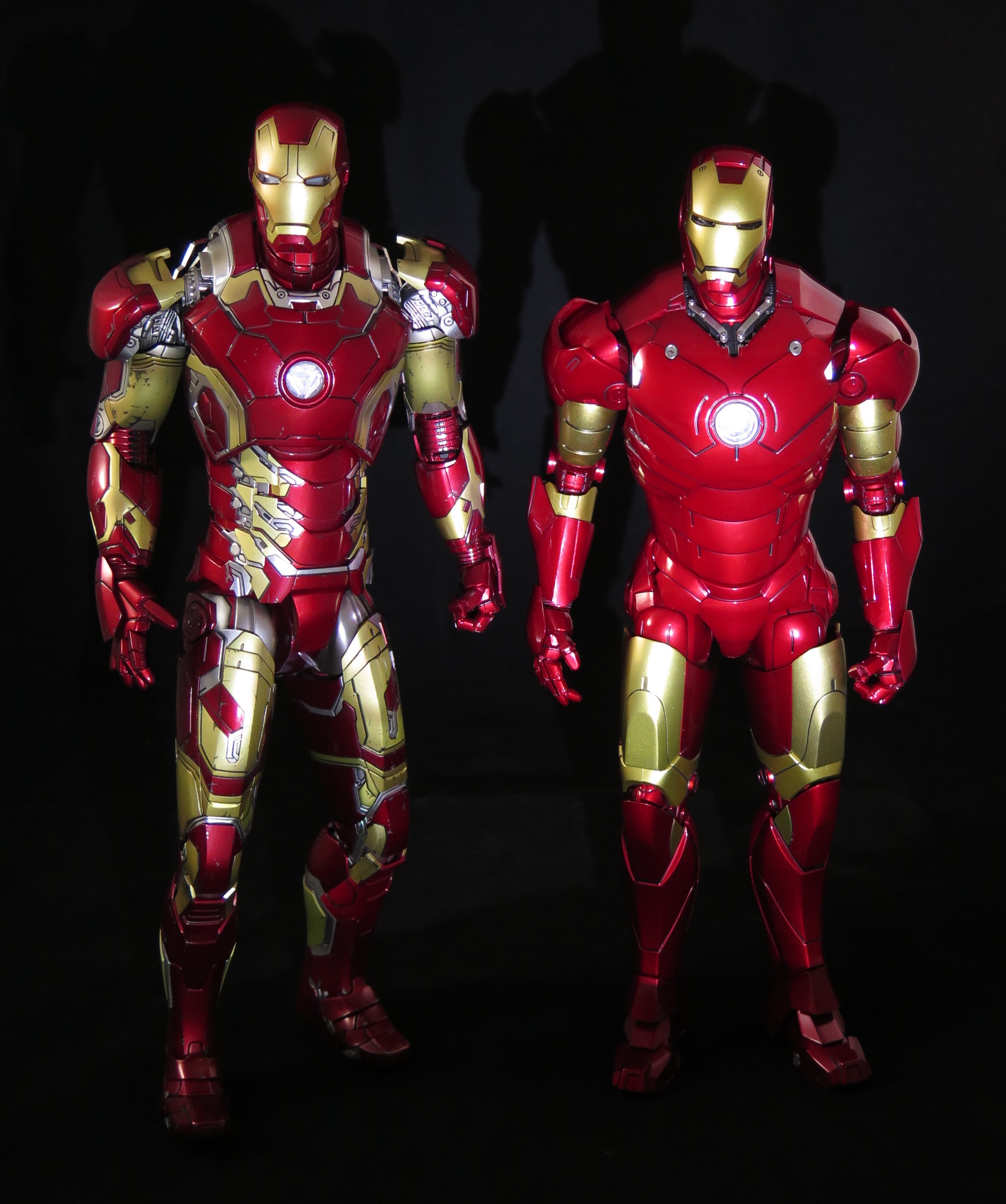
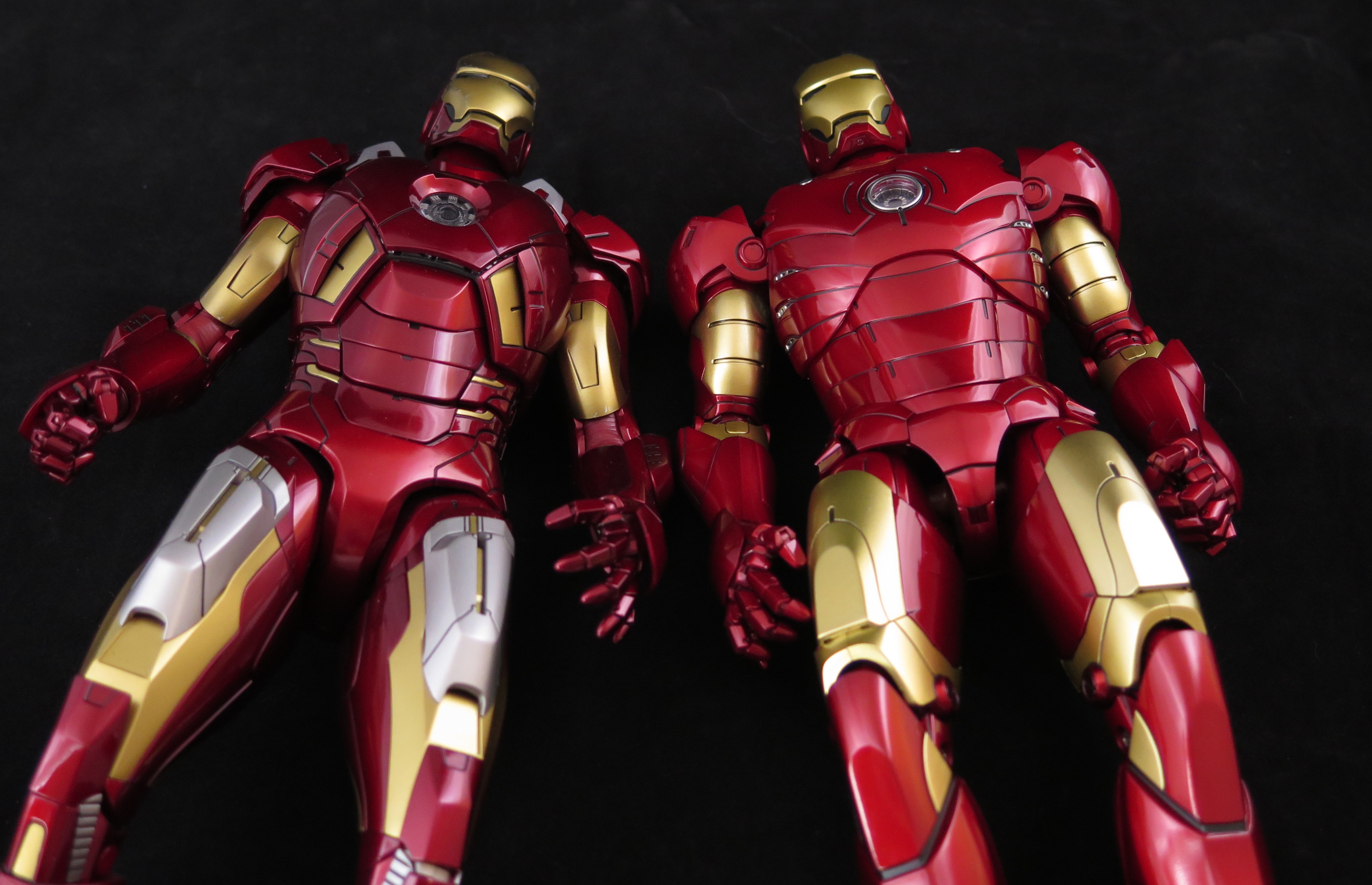
I pulled my Stark head out of the box to check, and you were right, it actually looks a bit similar. The jaw on mine pushes up further so it's flush with the rest of the helmet. The issue is that the face plate doesn't seem to be the right size to fit well. The black mouth line is the same thickness on both heads, so there's no difference there; but the face plate on the Stark head seems a bit shorter/smaller. It fits the top/sides fine, but it's less snug at the mouth area. I even put the Stark face plate on the lighted head, and the black mouth line was a tiny smidgen thicker than with the regular lighted face plate (though it could've been my eyes playing tricks on me). Either way, it does seem to be because of the design of that head.

Of course, I can now never unsee that, so the helmeted head will probably never see the light of day again. :lol

Hey man, thanks so much for working this out with me. Thought I was imagining things here or got a defect. I will still use the stark head though, but only when open.
 
Got my dieceast Iron Man Mk.III a couple of days ago. The sculpt, the paintjob, and all the attention to details really makes this a beautiful figure! At first I was a bit disappointed in the limited articulation, but I soon decided to use the twisted waist section and for once try on the ground punch/landing pose. It took a bit of fiddling, but I think I got it close enough. :)


Excellent job! I really need a video tutorial on how to do the 3-point pose, someone post 1 please!
 
Thanks man! Glad you like it! :) I don't have a video tutorial, but I can say that it is all about using the available range of motion on the arms and legs. At first I didn't realise that the legs could bend even further at the knee. The last three stops are quite firm. :)
 
Back
Top