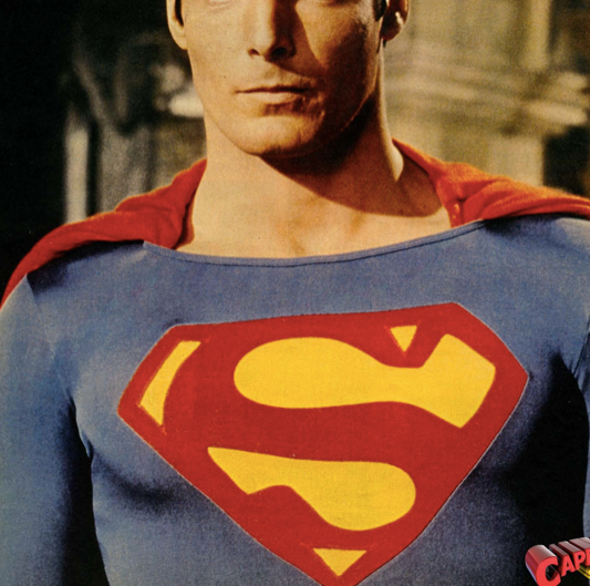
If I showed you a side by side comparison photo with the HT rubbery logo placed next to the accurate printout, you would see just how "idealized" and innacurate the HT logo is (I'm talking about the yellow shapes, not the overall size).
Why haven't you done this?
Would you like them to put the Batman Returns logo onto the 1989 Keaton movie costume just because they think it looks better than the one which appeared on the actual costume? I certainly wouldn't want to see that and I'm sure the vast majority of collectors would agree with me. This is no different in my opinion.
I wouldn't want the Superman Returns shield on this figure.
That would be the same as the example you gave. Taking the original 1978 design and making it more symmetrical is totally different.
Here is the comparison I would use: Batman '89 boots were made out of Nikes, but I want "idealized" boots. I don't want them to look obviously like homemade boots. Batman's boots and Superman's Shield don't look homemade on the pages of comics and the only reason they have on screen is because they basically
were homemade. This is due to the constraints of costume design back when Reeve's Superman and Keaton's Batman were made. If those movies were made today there is no way they would look that sloppy.
Personally, I prefer slight changes to costumes in an effort to right the wrongs done by the original costume design team. It presents the character as we
imagine them more than they way they actually
were with all their imperfections. No one will come into my collection room and think 'wow, what a cool figure, but I don't remember the "S" looking like that.' But if the "S" was literally screen accurate some might think, 'was the "S" really that sloppy in the movie?' Do you get what I'm saying?
One more example. It's a pet peeve of mine that Sideshow's ANH Vader has one silver tusk and one black tusk. That was a mistake on set, and I wish Sideshow had righted the wrong (although that would have pissed off most SW collectors).
Everyone knows how I feel about the HT logos and there's no point discussing it any further in this thread because I'm already replacing the HT logos with accurate versions. I'm not asking you to stop liking your figure.
In the past it honestly felt like you were trying to do just that, so I thank you for saying that.
I'm just doing something to my figure which in my eyes will improve it for my own collection. Isn't that what customization is all about?
Yes. And I'm not trying to talk you out of modifying your figure. I hope it comes out to your satisfaction.
Although I have no interest in changing the shield or boots on mine I will follow this thread to see your progress. I don't want to get in a flame war, and I hope we understand each other's point of view here.


")