strange how that scene (above)was deleted for 25years or so in the west years due to warners thinking it was too philosophical for western folk (along with the opening monk scene)
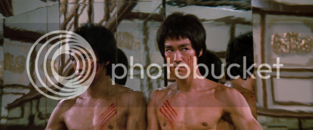
Yeah true, for me that is just a minor nit pick, the sweat paint apps and the simple claw mark designs is what makes this statue look like a poor quality statue, even though it isn't.
The box has to be less than 140 cm in girth, for Australia post to ship it. Will the statue be able to fit in a box smaller than that? I am pretty sure only courier companies like Fed X, DHL UPS, etc will be able to take this and they will charge a few hundred at least to ship this. That being said, I hope you can prove me wrong.
Yeah that is how it should have looked, but given the price and scale of the statue, I think we all knew it wasn't going to look like this. The only thing that is inexcusable on this statue is the sweat apps and horrible simple design claw marks , as the paint job shading on the statue is decent as it has different tones, despite that the flesh tone is too pale in color.
Looking forward to seeing some pics of the finished article mate..finally took the plunge and redid the cuts,slightly lightened/widend them and gave the appearance of smudges.cheeks look better body cuts need a bit more work on them.but they stand out/pop much better.I'm pretty happy.
I kinda tried and go with the wider cuts look of the proto,rather than the elaborate(and tricky)runs that others have done.even just a slightly lighter colour stops the cuts looking flat/cheap and pop more.i tried to give the smudge look that would be created when you move/bend,and did a couple of very faint runs also.pretty happy.
Looking forward to seeing some pics of the finished article mate..finally took the plunge and redid the cuts,slightly lightened/widend them and gave the appearance of smudges.cheeks look better body cuts need a bit more work on them.but they stand out/pop much better.I'm pretty happy.
c'mon guys you know how my photo taking skills suck.here's a few,the face cuts are an extreme close up of about 2/3inches and look a bit messy,but they look really good from a few feet away.i think just going over the cuts with a lighter/glossier colour lifts them really well.
like I've said nothing professional but inhand i'm happy.
there's 2 lightly coloured sweat/blood runs coming from the chest cuts(faint but they are there.)
and smudging slight runs from the ABS/face..looks much better IMO than the factory cuts.
cheers mate.i'm thinking of maybe trying some sweat runs to try and blend the blobs better.i tried following the sweat on the abs and adding some light blood smudges,turned out ok I think.
yeah I always thought the cuts were dull and flat looking,just lightening them with a little smudging looks better.shame about the distance between them but they don't look as fake if that's the correct phrase.
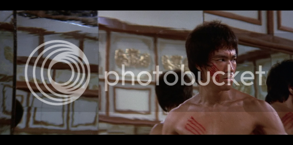


 yes I did thicken them up and added a few runs... but I pretty much follow the lines.


 .here's a few,the face cuts are an extreme close up of about 2/3inches and look a bit messy,but they look really good from a few feet away.i think just going over the cuts with a lighter/glossier colour lifts them really well.


