Frostlord
Super Freak
Yeah I should have waiting a but longer before ordering


How in the actual **** are people saying this statue and pose suck...
I don't comprehend it...
Yup, this pose is awesome. It's just the base the has ??? over it. I don't really see a better pose anywhere.
I can understand the people not liking the base, but this is by far the best spiderman pose ever done. (Assuming it shows up with no leaning of course.)
That's all just a matter of opinion savage. I personally like the pose on the original COM and the Koto Spidey better than this new PF. That's not to say I don't like the pose on the new PF. I'd rank it just behind the other 2 pieces I mentioned. However, that's just my opinion.

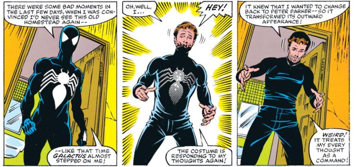
This statue is a lot more blue than in the original comics the Symbiote appeared in...first appearing in Amazing Spider-Man 252 I believe? Somewhere around that number...it beat Secret Wars 8 to print by several months. It was one of the earliest trades I bought..."Saga of the Alien Costume". The alien costume was used way less than people think before Peter starting using the cloth Black costume to replace it, switching back and forth for several years in the late 80s.
The art back then used thin blue highlights, not full on shading (like in later years with the cloth costume and Venom) just enough to show Spidey's muscle definition but there was no mistaking in those comics that the alien was black. In full on day light shots it'd be black. So it's really throwing me off here that this statue is so blue...didn't think it would be, but this might be a pass for me. Yeah, simple detail, but it's also $480 for a design choice I'm not keen on. Call me picky if you'd like...you're right, I am. Lol.
Hmmm just noticing in all my years of reading and owning this comic that the back of Peter's right hand in the front panel is miscolored, it should be white.
I even agree that these are opinions. I can see why you like the comiquette better. Another iconic wall crawler pose. But to say this new pose is terrible... It just hurts.
I even agree that these are opinions. I can see why you like the comiquette better. Another iconic wall crawler pose. But to say this new pose is terrible... It just hurts.
Depends on who was drawing/coloring the book. Each book that had the costume in it was a bit different
")

That's all just a matter of opinion savage. I personally like the pose on the original COM and the Koto Spidey better than this new PF. That's not to say I don't like the pose on the new PF. I'd rank it just behind the other 2 pieces I mentioned. However, that's just my opinion.
I'm actually loving this piece. I can't believe all the comments about a single promo photo....SS always throws all sorts of colored lights on their statues in their photos... we'll see if it really is that blue... I doubt it. Is terminators endoskeleton red and blue? Unlikely

Great, now all I think about is Wayne's World. Schwing!!
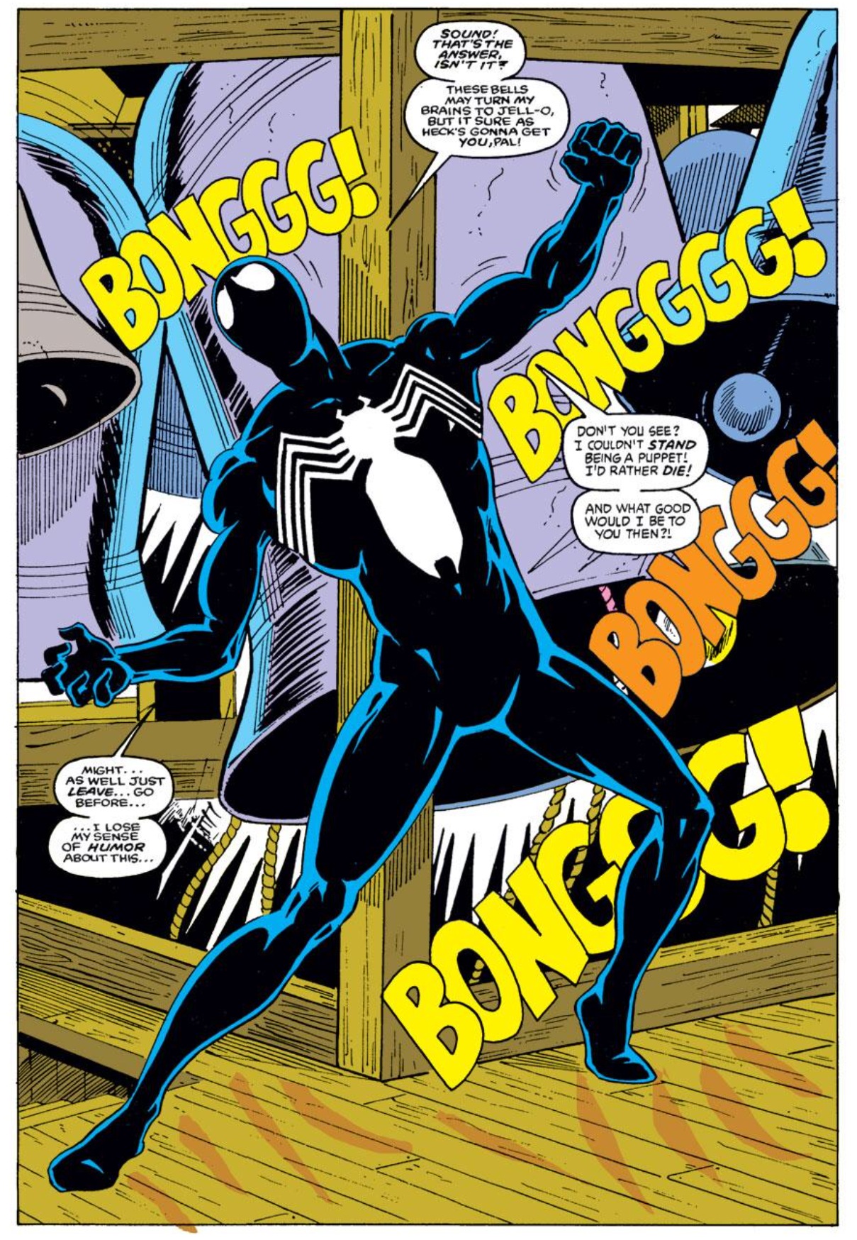
What's going on with the left forearm?
I even agree that these are opinions. I can see why you like the comiquette better. Another iconic wall crawler pose. But to say this new pose is terrible... It just hurts.
Enter your email address to join: