jpuli28
Super Freak
 Nevermind I reread your statement, the context was lost in the text, lol.


 Nevermind I reread your statement, the context was lost in the text, lol.
That body Sideshow is using is just too short. I don't care if it more correctly mimics real human proportions, it's just too short. He either needs a new body or a smaller head.
Also, your photoshopped version really shows that Sideshow should have gone with the black version first. That costume looks awesome.
Sideshow needs to copy your homework and release that black n grey version next. Very nice photoshoppin.
")
The chest symbols should be swapped. Blue gets yellow, black get black. Im diggin your version of the cape too, just little longer tho.
Dig the realistic human eye positioning in that PS'd version.
Darklord1967. Now that's a name I haven't heard in a long time, a long time.

 Darklord1967. The raised belt really helps with the proportions.
I like your custom shop there Roberto!
How's that little 4" Boba Fett custom you were working on, doing by the way???
Us Scummers are in purgatory waiting for your updates man!!!
Great job, Darklord1967! IMO the adjustment you did with the eyes improved the over-all proportion of the face.
Thanks HeubertMichael. Yeah, like most fans, I have a strong feeling for what this character should look like. To me, SIMPLICITY of the outfit is key (this is why the classic costume works BEST to my eyes and NOT that all-black armored "Robo-Bat" stuff from the movies or the video games. Also, I find that razor straight vertical lines work very strongly for this character... no rounded lines. He needs to look angular to appear more menacing... particularly in the head / and face features. He DEFINITELY looks best when viewed straight on. The Batman's face in profile or 3/4 view loses more than half of its power and effectiveness in my opinion. This is why the size and INTENSITY of the blank eyes is SO important: Too small, and the Batman comes off looking Asian and overly squinty... in some cases, even sleepy. Too large and he comes off looking wide-eyed, surprised, cartoonish (like in Batman: The Animated Series). It is definitely a delicate balance with The Batman's blank eyes.

Thanks Astro13zombie!
Here's a side by side before and after comparison:

Hot Toys?
Blue is where it's at. A black version will be coming.
That black suit does look ALOT better IMO.
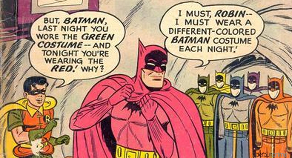
Well I honestly think that Bob Kane and Bill Finger INTENDED for "The Bat-Man's" costume to be comprised of a dark grey bodysuit with shiny, leathery cape, cowl, gloves, boots, and trunks. In the four-color world of comics, that was represented as black with blue highlights (like the hair on black-haired characters).
As the years passed, for whatever reason, the blue highlights became more and more dominant on the printed page until that became the colors of those costume components.
But BLACK is what is logical for a character who wishes to blend in with the shadows and stalk criminals in the night like an urban legend, boogeyman, specter.
Completely agree. When you look at the old Bob Kane comics there are lots of panels where his cape, trunks, boots and gloves are represented as almost totally black. The blue was just there to highlight them. By the time we got to **** Sprang though, a decision was made that Batman's colors should be grey and blue. (Also he became an official deputy of the Gotham Police Department. And he started running around with a kid wearing green panties.)

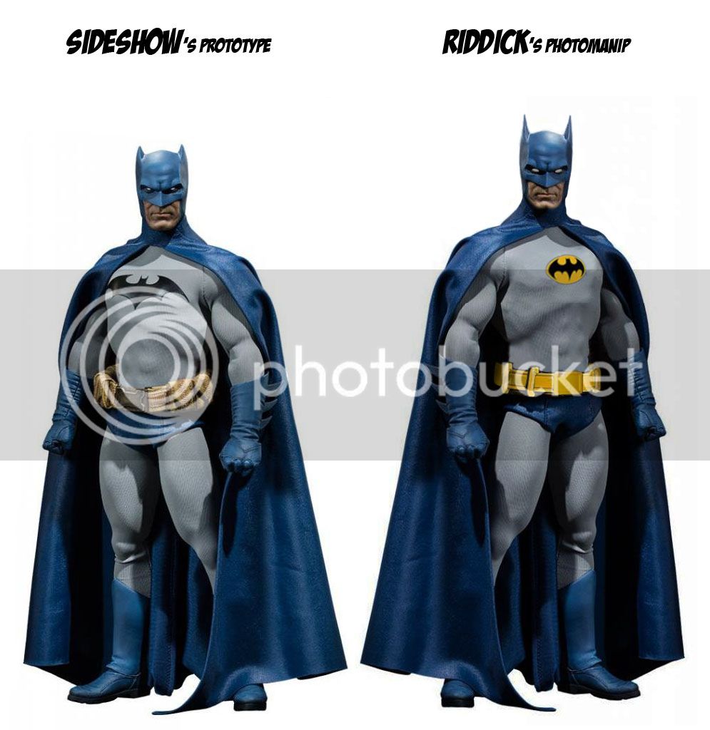
I can understand folks wantin gray-n-blue, but what Sideshow did is a design mess (as always).
These proportions doesn't work with blue, and the blue itself is too bright to work for the figure.
Anyway, my two cents before disparaging to avoid another rant by Sideshow's fanatics:
... And he started running around with a kid wearing green panties.)
If theres one thing that sheds negativity about this badass superhero...

Enter your email address to join: