Well that like your opinion man...
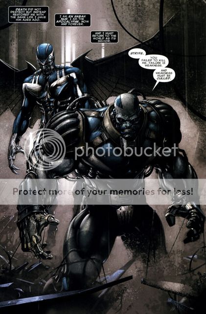
Behold what apocalypse should look like (according to me):
Notice the design of the shoulder and for-arm protectors and the lack of "A" on the belt (which the age of apocalypse one does not have either). These make him look more squat and menacing in my opinion. The SS statue should have been more broad and less tall. Plus I don't like the ski boots he is wearing. I think what I like about the above apocalypses is that the ratio between the shoulder size and the waist size is much greater than that on the statue - giving that version a much bulkier look. Just my opinion.


 that will make a sweet EX