RobertoBagg10
Super Freak
 thanks Joe
 ") the pics look great with the 1/4 Com side by side...impressive piece
the pics look great with the 1/4 Com side by side...impressive piece 


 thanks Joe the pics look great with the 1/4 Com side by side...impressive piece
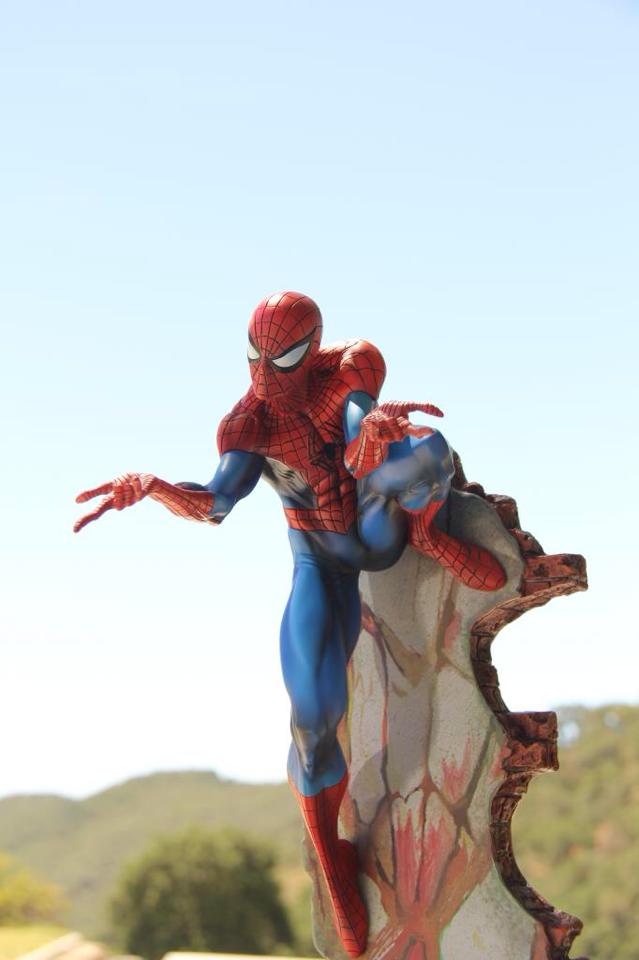
 Great pic, I think the shading on the blue is done well. Wishing we got the matte but it still looks good regardless. I think SS will continue to have issues with the black lines for Spidey fully sculpted pieces. Interested to see how well XM handles that delicate process.
Hello Everyone!
I'm new to the forum and I just got my Spiderman Comiquette today. Its my first piece from Sideshow! I love the piece but I feel a little disappointed because I found a lot of little things that I wasn't happy with. Its mainly the paint apps on the statue and the foot not going all the way in. The black webbing isn't laid on evenly and its pretty messy in some of the pics below. I don't know if I'm just being too picky or if its suppose to be like this. I was wondering what you guys think, and If it warrants a replacement from sideshow how do i go about it? Does it even qualify for a replacement? Thanks for in advance and sorry for the crappy pics.
Also On the Ex Head on the left side of his face(which would be right for us looking at the pic)...there is a black/gray smudge giving him a faint 5 o'clock shadow. Its super faint in the photos but I can see it in person.
View attachment 119965View attachment 119966View attachment 119967View attachment 119968View attachment 119969
This piece seems a little tricky when it comes to scale. For instance, he looks pretty damn good when I look at the pics of him next to the 1/4 Venom COM. However, next to the 1/5 Punisher COM, he looks rather small. That seems weird. I expected him to look small next to the 1st Spidey COM. That piece is slightly larger than 1/4 scale. It's just odd to me that he looks good next to a 1/4 Venom but seems out of place with a 1/5 Punisher. Pics of this with the Hobgoblin COM would be a great measure of this pieces scale. Both are 1/5 pieces and should look perfect together.
Anyway, I LOVE seeing all these pics. I don't plan on picking up this COM but I'm really enjoying all the pics of this statue from various angles and with other pieces. Spidey is looking great. Congrats to all of you peeps adding him to your collection.
I think it's because Venom, Hulk etc are typically drawn huge, much larger than the average person. Next to normal human-sized characters he looks like a midget
Well, he did look out of place next to the Punisher COM and that did surprise me. However, if we can see pics next to the Hobgoblin COM, I think we'll get a pretty good idea if this piece is actually 1/5 scale. SSC has made a few of their COMs rather small. I own 2 of them. I have the DD COM which looks cool as hell but definitely doesn't look like a 1/5 piece. The other one I have is the Ultron COM. That piece is small enough to mix in with some of my larger Bowen pieces and pretty much fit right in. As much as I dig the Ultron COM, I wouldn't have bought it strictly for my SSC collection. It's too small. However, I have him next to my BD Thanos statue and they look great together. I actually purchased the Ultron COM for my BD collection.
After seeing pics of this Spidey COM, it's starting to look like he may fall into the smaller 1/5 category like DD and Ultron. The one thing all 3 pieces have in common for me...they all look really good.
have to agree that this looks more to scale with the original Venom and Rhino imo. nothing against the original Com of course, but thought he was a tad on the large size compared to Venom, Carnage and Rhino, just saying.
After looking through the photos again I have decided that this is the angle I will be displaying him at.
Great angle Jaws. It captures the perfect lighting for the piece
That angle is ALL FULL OF WIN
After looking through the photos again I have decided that this is the angle I will be displaying him at.

If the majority is overall happy with the statue and think the shading's ok, and the proportions are good, couldn't the glossy paint be simply mattefied with an over-the-counter clear matte spray product like this one? https://www.krylon.com/products/matte-finish/ Just curious...
Enter your email address to join: